
Quick answer: A useful app palette includes more than attractive accent colors. It needs stable backgrounds, readable text, clear actions, visible borders, semantic states, and tested foreground combinations. Start with roles, then adapt the mood to the product.
Begin with product context
A finance dashboard, drawing app, meditation tool, game, and delivery service should not all use color in the same way. Before choosing swatches, define what the interface must communicate.
Ask:
- Is the experience focused, playful, technical, calm, or expressive?
- Will users spend minutes or hours in it?
- Is the content mostly text, imagery, data, or controls?
- Does the product need light, dark, or both themes?
- Which states must color communicate?
The answers determine how much contrast, variety, and visual energy the palette should carry.
Choosing a color palette for app design starts with these functional needs, not with collecting unrelated accent colors. A palette becomes useful when each value has a clear role and works in the components where it will appear.
Build roles before collecting colors
A modern app usually needs:
- canvas or page background;
- raised surface;
- primary and secondary text;
- border or divider;
- primary action;
- secondary action;
- success, warning, danger, and information states;
- focus and selected states.
Starting with roles prevents a common mistake: collecting five attractive accents without any workable background or text colors.
The values below are starting ideas. Test them in actual components and adjust them to the product’s accessibility and brand requirements.
Palette idea 1: dark creative workspace
This palette suits a color, photo, editing, or developer-oriented tool:
| Role | HEX |
|---|---|
| Canvas | #07111F |
| Surface | #0F172A |
| Primary text | #F8FAFC |
| Secondary text | #94A3B8 |
| Action | #38BDF8 |
| Expressive accent | #EC4899 |
The navy surfaces keep the workspace quiet, while cyan creates a clear action path. Pink should be used in smaller amounts for selected details, charts, or creative emphasis.
Use near-white text for primary reading and muted gray for supporting information. Verify that muted text remains readable at mobile sizes.
Palette idea 2: crisp productivity interface
A light productivity app benefits from restrained surfaces and one confident action color:
| Role | HEX |
|---|---|
| Canvas | #F8FAFC |
| Surface | #FFFFFF |
| Primary text | #0F172A |
| Secondary text | #475569 |
| Action | #2563EB |
| Border | #CBD5E1 |
This palette leaves space for documents, tasks, or data. Blue indicates the main action without dominating every component.
Avoid using the action blue for ordinary headings and decorative icons at the same time. Preserve its meaning by reserving it for links, focus, and interactive states.
Palette idea 3: nature and wellness
Natural greens can feel calm when paired with neutral surfaces:
| Role | HEX |
|---|---|
| Canvas | #F4F7F2 |
| Surface | #FFFFFF |
| Primary text | #163020 |
| Secondary text | #52665A |
| Action | #2F855A |
| Warm accent | #C97A40 |
The green action fits the theme, while the warm accent prevents the interface from becoming a single-hue environment.
Do not use green as both the brand action and the only success signal without another cue. Add text, icons, or shape so status remains understandable.
Palette idea 4: warm creative portfolio
An editorial or portfolio app can use warm surfaces with a deep cool anchor:
| Role | HEX |
|---|---|
| Canvas | #FFF8F1 |
| Surface | #FFFFFF |
| Primary text | #27203A |
| Secondary text | #6B6475 |
| Action | #7C3AED |
| Accent | #F97316 |
Purple and orange create energy through contrast. Keep large areas quiet so imagery and project content remain the focus.
Use orange for small highlights rather than long text. Check the purple action against both white and warm surfaces, especially in smaller controls.
Palette idea 5: focused data dashboard
Operational dashboards need clarity across dense information:
| Role | HEX |
|---|---|
| Canvas | #0B1220 |
| Surface | #111827 |
| Primary text | #F1F5F9 |
| Secondary text | #94A3B8 |
| Action | #22D3EE |
| Highlight | #FACC15 |
Cyan can mark interactive data, while yellow can highlight exceptions or attention. Neither should replace semantic status colors.
Charts need more than visually distinct hues. Test color combinations for common color-vision differences and add direct labels, patterns, or markers where possible.
Palette idea 6: friendly social tool
A social or creator app may use stronger accents while keeping content legible:
| Role | HEX |
|---|---|
| Canvas | #F8FAFC |
| Surface | #FFFFFF |
| Primary text | #1E1B2E |
| Secondary text | #625B71 |
| Action | #DB2777 |
| Supporting accent | #0EA5E9 |
Pink provides personality, and blue creates a secondary path for information or links. Avoid placing both accents at equal intensity in every viewport. One should lead while the other supports.
Photographs and user content already add color, so interface chrome may need to remain quieter than the brand palette.
Turn a photo into an app palette
Reference photography can produce a more distinctive direction than choosing colors from a generic wheel. Use an image palette generator to extract candidates, then translate them into interface roles.
A coastal photo might provide navy, cyan, sand, and coral. The app does not need to use all four equally:
- navy becomes the canvas;
- pale sand becomes a light surface;
- cyan becomes the main action;
- coral becomes a limited highlight.
Read how to create a color palette from an image for the full extraction and refinement process.
Create a usable color scale
One primary swatch is not enough for a complete component system. Build a small scale for subtle backgrounds, borders, default actions, hover states, and strong text.
For a blue primary:
:root {
  --blue-100: #DBEAFE;
  --blue-300: #93C5FD;
  --blue-500: #3B82F6;
  --blue-700: #1D4ED8;
  --blue-900: #1E3A8A;
}
Do not assume every adjacent value works as text on the next. Test the combinations used in real components.
Plan semantic colors separately
Brand colors and status colors have different responsibilities. Define success, warning, danger, and information with clear foreground, background, and border values.
:root {
  --success-text: #14532D;
  --success-surface: #DCFCE7;
  --warning-text: #713F12;
  --warning-surface: #FEF9C3;
  --danger-text: #7F1D1D;
  --danger-surface: #FEE2E2;
}
Support each status with words or icons. Color should reinforce meaning rather than carry it alone.
Test black and white foregrounds
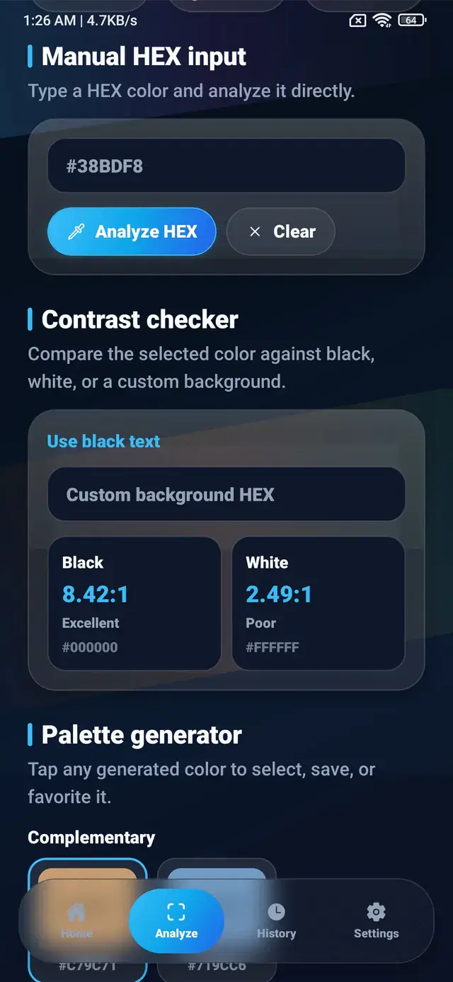
When an accent becomes a button background, compare dark and light text. Bright cyan and yellow usually favor dark text. Deep blue and violet often favor light text, but exact values must be calculated.
Use the guide to readable text color contrast and test the actual font sizes, weights, and states.
Pressed and disabled variants need separate checks. A default button passing a target does not guarantee that its hover state also works.
Support light and dark themes intentionally
Dark mode is not created by simply inverting every value. Surfaces need controlled elevation, text needs reduced glare, and vivid accents may need lower saturation or adjusted lightness.
Keep semantic roles stable across themes:
color.canvas
color.surface
color.text.primary
color.action.primary
Then assign theme-specific values to those roles. This keeps component logic understandable and lets designers tune each environment.
Use ColorSnap during palette development
ColorSnap can identify colors from reference photos, show HEX, RGB, HSL, and CMYK values, extract palettes, save selected colors, and check contrast.
The features page outlines the available tools. Designers can use the app to collect source colors, then move into their main design system for component states, accessibility review, and final documentation.
Frequently asked questions
How many colors should an app palette have?
Start with a small set of roles, then add variations and semantic states as needed. Count roles and use cases rather than aiming for an arbitrary number of swatches.
Should every app use blue as its primary color?
No. Blue is common because it works across many contexts, but the product’s identity, audience, content, and accessibility needs should guide the choice.
Can one accent color handle every state?
Usually not. Actions, success, warning, danger, and information need distinct meaning. Do not force one brand color to represent conflicting states.
How do I make a palette feel modern?
Use clear hierarchy, restrained accents, readable typography, consistent surfaces, and purposeful states. A current interface depends more on disciplined application than on one fashionable hue.
Where should I start with a photo?
Choose an image that matches the product mood, extract representative colors, remove duplicates, and assign each remaining color a functional role.
Explore ColorSnap color tools
Start from the ColorSnap homepage or review the complete app features. For focused workflows, learn about the Android color identifier, use the photo color picker, or explore the image palette generator. The ColorSnap FAQ answers common questions about formats, images, saved colors, and app usage.