
Quick answer: To create a color palette from an image, choose a clear photo, extract several representative colors, remove near-duplicates, and assign each remaining color a role such as background, text, primary action, or accent. The strongest palette reflects the image without trying to include every shade.
Why create a palette from an image?
Photos already contain relationships between light, material, atmosphere, and color. A sunset balances warm orange with darker violet. A forest combines multiple greens with earthy neutrals. A product photo may contain a brand color, surface tone, shadow, and highlight.
Extracting a palette turns those visual relationships into reusable color values. The result can guide an app interface, illustration, presentation, poster, social graphic, or mood board.
The goal is not to copy every pixel. A useful palette simplifies the image into a small set of colors that can perform clear jobs.
Step 1: Choose an image with a clear mood
Start with an image that supports the feeling and subject of your project. Ask what makes the image visually distinctive:
- Is it bright or subdued?
- Does it feel warm, cool, natural, playful, or technical?
- Is there one dominant color or a balanced mix?
- Are the most important colors in the subject or the background?
A sharp image is easier to inspect, but composition matters too. If half the photo is a neutral wall, an automatic extractor may treat that wall as the dominant color even when a smaller object is the real inspiration.
Crop the image around the relevant subject when necessary. This gives the palette generator better visual material to analyze.
Step 2: Extract representative colors
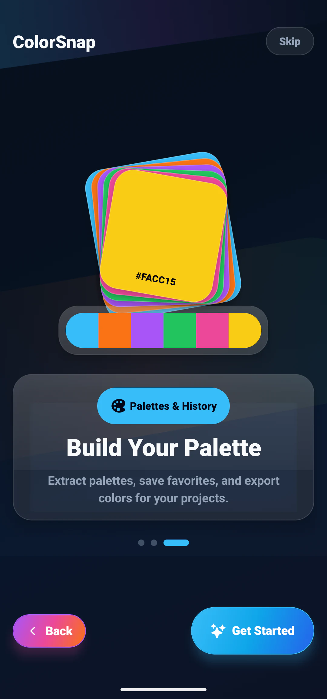
Open the photo in an image color palette generator. ColorSnap can scan the selected image and produce a set of candidate colors that you can review, copy, and save.
Palette extraction usually groups similar pixels rather than returning every unique value. A photo may contain hundreds of thousands of colors because of texture, lighting, and compression. Grouping reduces that complexity into representative clusters.
Automatic results are a starting point. Compare the generated strip with the original image and ask whether it captures the important subject, contrast, and mood.
Step 3: Remove near-duplicates
Two colors can be numerically different but visually too similar to serve separate roles. For example, a generated palette might include #0F4C5C and #124F5F. Keeping both may add little value.
Choose the stronger representative and use the available space for a lighter, darker, or contrasting color instead. A balanced five-color palette often benefits from:
- a dark anchor;
- a light surface;
- a primary color;
- a supporting color;
- a distinct accent.
This is a design framework, not a fixed rule. An illustration palette may need several related tones, while an interface palette needs stronger functional separation.
Step 4: Assign a role to each color
An unlabeled strip is inspiration. A role-based palette is a system.
Consider this ocean-inspired example:
| Role | Color | Possible use |
|---|---|---|
| Dark anchor | #071E2C |
Primary text or deep background |
| Surface | #E0F2FE |
Light panel or quiet section |
| Primary | #0284C7 |
Main action or active state |
| Supporting | #38BDF8 |
Links, focus, or illustration |
| Accent | #F97316 |
Small highlight or attention cue |
Naming by role makes the palette easier to apply consistently. Names such as primary, surface, and accent communicate intent better than blue-one and blue-two.
Step 5: Check contrast and readability
A palette may look attractive as five equal swatches but fail when used for text and controls. Test the actual combinations you plan to use.
Dark text usually works better on pale surfaces, while light text is more suitable on dark backgrounds. Mid-tone colors require careful checking because neither black nor white is automatically readable in every size and weight.
Use the contrast guidance for readable text to evaluate foreground and background pairs. Decorative colors can be flexible, but text, icons, focus states, and controls must remain understandable.
Step 6: Build light and dark variations
The photo may provide one excellent primary color but not all the states an interface needs. Create controlled variations for hover, pressed, selected, subtle backgrounds, and borders.
For a primary blue #0284C7, you might test:
:root {
  --primary-strong: #0369A1;
  --primary: #0284C7;
  --primary-bright: #38BDF8;
  --primary-soft: #E0F2FE;
}
These values should be visually evaluated together. Avoid assuming that a simple percentage adjustment will preserve readable contrast.
Example: a sunset palette
A sunset photo might produce:
- deep violet
#3B1C5A; - rose
#BE3A67; - orange
#F97316; - warm yellow
#FACC15; - pale sky
#FDE7D7.
For an app, the violet could anchor the background, the pale sky could provide text or a surface, and the orange could mark the primary action. Rose and yellow may work best as limited accents.
Using every vivid color across large areas would create visual competition. The image succeeds because each color occupies a specific amount of space. Your design should also control proportion.
Example: a forest palette
A forest photo may include dark evergreen #163020, leaf green #22C55E, moss #6B8E4E, bark #6B4F3A, and mist #DDE7DF.
This can support a calm dashboard or wellness interface, but the natural source does not remove accessibility requirements. Check whether the green action color is distinct from success messaging and whether the bark tone remains readable against the dark background.
The guide to color palette ideas for app design shows additional ways to adapt source colors to interface roles.
Export the palette for development
Once the palette is refined, store it in a format that supports consistent implementation:
:root {
  --color-background: #071E2C;
  --color-surface: #E0F2FE;
  --color-primary: #0284C7;
  --color-supporting: #38BDF8;
  --color-accent: #F97316;
}
ColorSnap’s app features include CSS variable export, favorites, and history, which help move selected values into a project without repeatedly reading the original image.
Common palette extraction mistakes
Keeping too many colors
More swatches create more decisions. Start with a compact set and add a color only when it has a defined role.
Treating frequency as importance
The most common pixel may be an unimportant wall or sky. Select colors based on the project purpose, not frequency alone.
Ignoring neutrals
Bright accents need quiet backgrounds, borders, and text colors. Include useful dark and light neutrals.
Copying the image without adapting it
A photograph and an interface have different needs. Refine the palette for readable text, interactive states, and hierarchy.
For a shorter reference version of the extraction steps, see how to extract a color palette from an image. If your starting point is a single brand color rather than a photo, building a palette from one color covers the harmony rules that apply instead.
Explore ColorSnap color tools
Start from the ColorSnap homepage or review the complete app features. For focused workflows, learn about the Android color identifier, use the photo color picker, or explore the image palette generator. The ColorSnap FAQ answers common questions about formats, images, saved colors, and app usage.
Frequently Asked Questions
How many colors should an image palette contain?
Four to six colors is a practical starting point. The right number depends on the project and the role each color must perform.
Does a palette generator choose the final colors?
It provides useful candidates. A person should still remove duplicates, assign roles, test contrast, and adjust the palette for its intended medium.
Can I extract a palette from a screenshot?
Yes. Screenshots are useful sources for studying interface colors, but compression and scaling may slightly alter edge pixels.
Should every extracted color be used equally?
No. Most palettes need a dominant surface, supporting colors, and limited accents. Equal use can make the design feel noisy.
Can I save individual colors from the palette?
ColorSnap lets you keep useful values in history or favorites, then copy them into the design or development workflow that needs them.