
Quick answer: Designers can use a color picker app to capture references from photos, inspect UI screenshots, build palettes, document exact values, compare color variations, and check text contrast. The app is most useful when it supports a clear decision rather than replacing design judgment.
Turn visual references into usable values
Design work often begins with references that are not editable: a photograph, screenshot, poster, product package, material sample, or scene from everyday life. A color picker app converts those references into values that can enter a design file.
Instead of estimating a blue by eye, a designer can record #2563EB, compare it with nearby pixels, and decide whether it suits the project. This creates a repeatable starting point and makes later handoff clearer.
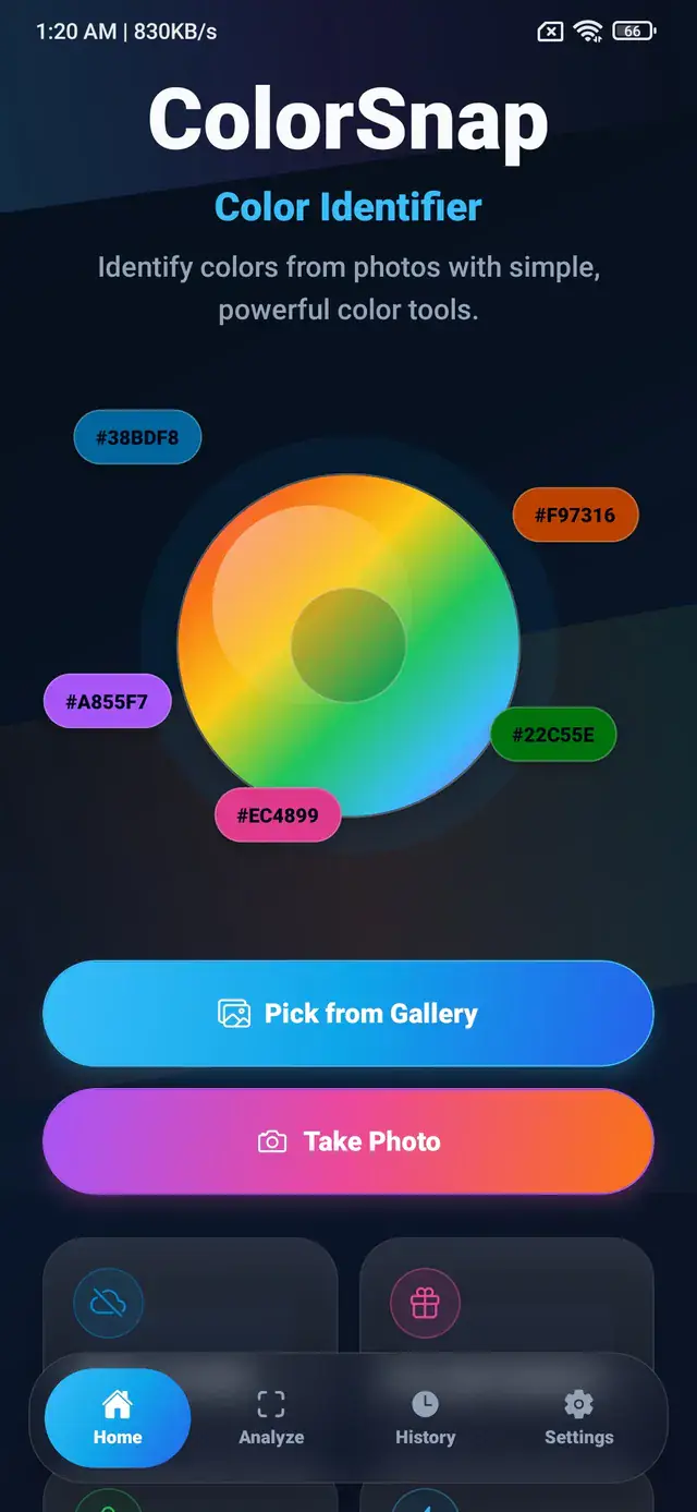
ColorSnap is an Android color identifier app that supports gallery and camera photos, making this workflow available away from a desktop design tool.
Inspect interface screenshots
Screenshots are useful for studying how other interfaces handle surfaces, hierarchy, and accents. Open the image in a photo color picker, zoom into a component, and sample its center rather than an antialiased edge.
Useful areas to inspect include:
- page and card backgrounds;
- body and secondary text;
- buttons and active navigation;
- borders and separators;
- status colors;
- focus and selected states.
Treat the result as analysis, not as permission to copy another product’s identity. The goal is to understand relationships: how dark the surface is, how strong the contrast feels, and how sparingly an accent is used.
Build a mood board from real scenes
A designer may find a useful combination in architecture, clothing, nature, food, or street photography. Sample several representative points and save them with meaningful labels.
For example, a city photo after rain might contain:
- asphalt
#252B32; - reflected cyan
#38BDF8; - sign pink
#EC4899; - warm window
#F59E0B; - mist gray
#CBD5E1.
The resulting palette can guide an interface or campaign, but it should be refined for the new context. A photograph can tolerate subtle distinctions that disappear when colors become small buttons or thin text.
Generate a palette, then edit it
An image color palette generator can quickly reduce a complex photo to several representative colors. This is useful during early exploration, especially when the image contains a strong visual mood.
After extraction:
- remove near-duplicate swatches;
- keep a useful light and dark anchor;
- identify the primary color;
- choose one limited accent;
- assign each color a functional role.
The guide to creating a palette from an image explains why role assignment matters more than keeping every generated color.
Compare material and environment colors
Interior, product, and graphic designers can use camera photos to collect approximate material references. A fabric, package, wall, or plant can inspire a digital direction.
Take the photo under even lighting and sample multiple areas. Textured surfaces rarely have one uniform value. A wooden panel may include a base brown, a dark grain, and a warm highlight.
Record the source and lighting conditions alongside the colors. The values are image-based references, not calibrated physical measurements. Production decisions should use the appropriate material samples and color-management process.
Create design tokens from selected colors
Once a palette is approved, convert visual swatches into named roles:
:root {
  --color-canvas: #07111F;
  --color-surface: #0F172A;
  --color-text: #F8FAFC;
  --color-muted: #94A3B8;
  --color-action: #38BDF8;
}
Semantic names help the design and development teams discuss intent. “Action” remains understandable even if the exact cyan changes later.
ColorSnap can export CSS variables as a starting point. Review naming conventions before adding them to a production design system.
Explore lighter and darker states
A selected color is often only the middle of a scale. Interfaces may need subtle backgrounds, default actions, hover states, pressed states, borders, and strong text.
Use the HSL value to explore lightness and saturation while keeping a similar hue. If the source is approximately HSL(199, 95%, 60%), test lower lightness for a pressed state and higher lightness for a soft surface.
Do not rely on numeric symmetry alone. Human brightness perception varies by hue, so every state should be reviewed in context.
Check text and icon contrast
Before using a selected color for a button or background, test the intended foreground. Bright yellow may need dark text, while deep navy may need light text. Mid-tone colors require closer evaluation.
Contrast checking is especially important for:
- body text;
- small labels;
- icon-only controls;
- disabled and secondary states;
- status badges;
- links inside colored panels.
Read how to choose readable text colors for an explanation of relative luminance and why a simple RGB average can be misleading.
Document colors during client review
Names and swatches support conversation, while codes support decisions. A useful review note can include:
Primary action
Bright cyan
HEX #38BDF8
RGB 56, 189, 248
This format lets a client recognize the color and gives the implementation team an exact reference. If a value changes, update the design token and documentation together.
Saved history is useful during exploration because it preserves previous samples. Favorites can hold the smaller set that survives review.
Reconstruct a palette from an incomplete asset
Sometimes the original design file is unavailable. You may only have a flattened logo, screenshot, or exported image. A picker can recover approximate digital values from flat regions.
Choose areas without transparency, shadows, gradients, or compression. If the image was resized, compare several pixels and select the dominant interior value.
Document that the code was sampled from an asset. For brand-critical work, replace it with the official specification when that becomes available.
Use color names to organize, not implement
Friendly names help designers scan saved colors and communicate with nontechnical collaborators. Exact codes should remain attached to those names.
One project may contain several shades all described as teal. Labels such as “teal surface,” “teal action,” and “teal border” are more useful than relying on the broad color name alone.
The guide on color names and color codes explains why multiple codes can reasonably share one descriptive label.
Keep the workflow intentional
A color picker can produce many values quickly. That does not mean every sampled color belongs in the design.
For each saved value, ask:
- What role does this color serve?
- Is it distinct from existing colors?
- Does it work with the intended text?
- Does it support the brand and content?
- Is it needed across multiple components?
Removing an unnecessary color often improves consistency more than adding another variation.
A repeatable daily workflow
- Collect a small number of relevant images.
- Sample exact colors or extract candidate palettes.
- Save the useful values with clear labels.
- Assign roles and create necessary states.
- test contrast in actual components.
- document the selected codes.
- share tokens with development.
The ColorSnap features overview shows how picking, naming, palettes, contrast, history, favorites, and export support this sequence. The tool provides the measurements; the designer remains responsible for hierarchy, accessibility, meaning, and visual balance.
Frequently asked questions
Can a color picker replace a design tool?
No. It captures and organizes color information. Layout, typography, components, prototyping, and system management still belong in the broader design workflow.
Should designers pick one pixel or extract a palette?
Pick one pixel when a precise area matters. Extract a palette when you want the broader visual character of an image.
Are camera colors suitable for brand specifications?
Use them for exploration and approximate references. Final brand values should be approved and documented through an appropriate controlled process.
Why save both HEX and HSL?
HEX is concise for handoff. HSL makes related hue, saturation, and lightness adjustments easier to reason about.
Explore ColorSnap color tools
Start from the ColorSnap homepage or review the complete app features. For focused workflows, learn about the Android color identifier, use the photo color picker, or explore the image palette generator. The ColorSnap FAQ answers common questions about formats, images, saved colors, and app usage.