
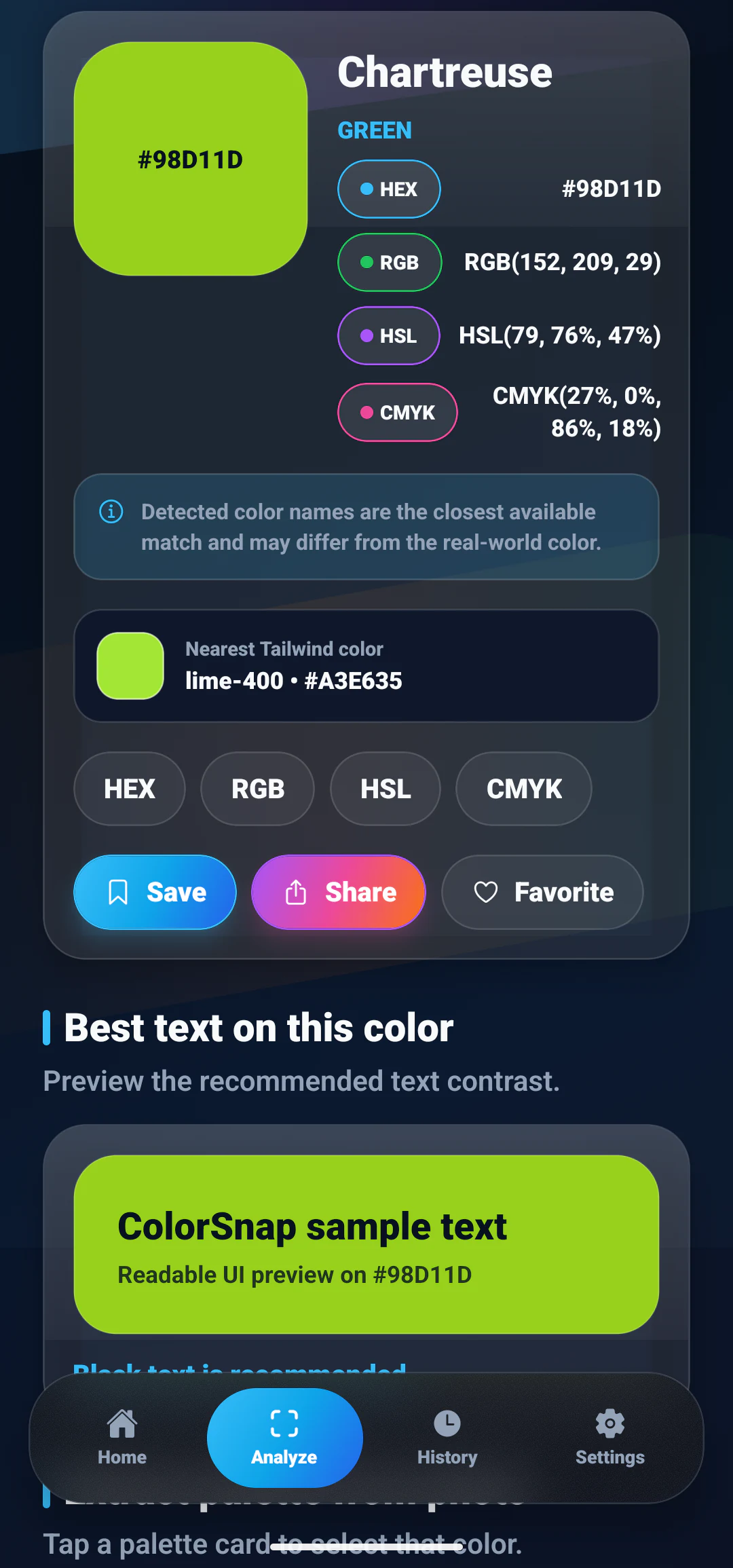
Quick answer: Choose text by comparing its luminance with the background, not by guessing from the color name. Light backgrounds generally need dark text, dark backgrounds need light text, and mid-tone backgrounds should be tested with both. Contrast ratio provides a more reliable decision than visual intuition alone.
Why text contrast matters
Text is useful only when people can read it. Low contrast makes labels harder to scan, increases effort during long reading, and can prevent users with low vision or certain display conditions from understanding the interface.
Contrast problems also affect people using a phone outdoors, a dim display, an older panel, or a screen with glare. A combination that looks subtle on a designer’s calibrated monitor may become unclear in ordinary use.
Good contrast does not require every interface to be black and white. It requires intentional relationships between foreground, background, size, weight, and purpose.
Contrast is a relationship between two colors
A text color is not readable by itself. #FFFFFF can be clear on #07111F and invisible on #F8FAFC. The foreground and background must always be evaluated as a pair.
Consider these combinations:
| Background | Text | General result |
|---|---|---|
#07111F |
#F8FAFC |
Strong light-on-dark contrast |
#F8FAFC |
#0F172A |
Strong dark-on-light contrast |
#FACC15 |
#07111F |
Dark text suits the bright yellow |
#38BDF8 |
#07111F |
Dark text is often clearer |
#A855F7 |
#FFFFFF |
Requires exact ratio testing |
The last example illustrates why broad rules are not enough. Purple can be light or dark, vivid or muted. Test the exact codes.
How relative luminance works
Contrast calculations estimate the perceived brightness of colors. The red, green, and blue channels do not contribute equally. Human vision is generally more sensitive to green than blue.
That means a simple average such as (R + G + B) / 3 is not a dependable way to choose black or white text. A vivid yellow and a medium blue can have similar channel averages while appearing very different in brightness.
Relative luminance calculations first transform the screen values and then apply weighted contributions. A contrast checker handles this math and reports the ratio between the lighter and darker colors.
Use a color contrast checker for the exact foreground and background codes rather than estimating from a screenshot. The calculation gives you a stable reference, while visual testing confirms that the chosen type size and weight remain comfortable in the real interface.
Understanding contrast ratios
A contrast ratio ranges from 1:1 for identical colors to 21:1 for black and white. Higher values indicate a stronger luminance difference.
WCAG guidance commonly uses these reference points:
4.5:1for normal-sized text;3:1for sufficiently large text;3:1for many meaningful interface graphics and control boundaries.
Conformance depends on the selected WCAG level, text size, weight, and context. Treat the checker as part of the design process and consult the current accessibility requirements that apply to your product.
How to choose black or white text
When a component background is dynamic, compare both candidate foregrounds:
- calculate the ratio between the background and dark text;
- calculate the ratio between the background and light text;
- choose the option that meets the relevant requirement;
- verify the result in the actual component.
For bright cyan #38BDF8, dark navy #07111F usually provides stronger contrast than white. For deep navy, white or near-white text is the natural choice.
Do not choose based only on whether the background “feels colorful.” Bright, saturated colors can still have high luminance and require dark text.
Example: a cyan action button
Suppose the button background is #38BDF8. The first design uses white text because white is commonly associated with colored buttons.
On inspection, dark navy text provides a clearer separation:
.primary-button {
  color: #07111F;
  background: #38BDF8;
  font-weight: 700;
}
This preserves the bright action color while improving label clarity. The exact choice should still be checked with the intended font size and final values.
Example: status badges
Status colors often create contrast problems because designers use pale text on a vivid background or low-opacity text on a tinted surface.
A safer pattern is to pair a dark status text with a pale status background:
.success-badge {
  color: #14532D;
  background: #DCFCE7;
  border-color: #86EFAC;
}
The border helps define the shape, while the foreground and background carry the label. Do not rely on green alone to communicate success; include an icon or clear text.
Text size and weight help, but do not solve everything
Larger and heavier text can tolerate a lower ratio under some guidelines because its strokes are easier to perceive. That does not make faint text a good design choice.
Small body copy, helper text, placeholders, table values, and mobile navigation need particular attention. Thin fonts can appear weaker than the numeric ratio suggests, especially on low-density or dim screens.
Test real strings, including longer labels and numbers. A large heading preview does not prove that a small caption using the same colors will be comfortable.
Avoid opacity surprises
Opacity changes the final displayed color because the foreground blends with the background. rgba(255, 255, 255, 0.6) does not have one fixed contrast ratio; the result depends on what is behind it.
For important text, define the final opaque color when practical. If transparency is necessary, calculate the blended result against every supported surface.
The same issue applies to gradients, images, and translucent cards. A label may be readable over one part of the background and disappear over another.
Text over photos and gradients
Images contain changing luminance, so one foreground color cannot guarantee readability across the entire area.
Possible solutions include:
- placing text in a stable solid region;
- adding a controlled dark or light overlay;
- using a text shadow only as supporting separation;
- moving the text outside the image;
- testing the darkest and lightest areas behind the text.
Avoid relying on blurred photography alone. The underlying brightness can still vary enough to weaken the text.
Contrast in disabled and secondary states
Disabled controls should look unavailable without becoming illegible. Reducing opacity too far can make the label disappear and may also make the state difficult to identify.
Use multiple signals: a quieter surface, reduced emphasis, a disabled cursor where relevant, and preserved label readability. Secondary text can be softer than primary text while still maintaining an intentional contrast target.
Hierarchy should come from typography, spacing, and placement as well as color.
Use a contrast checker in the workflow
ColorSnap includes a contrast checker among its color tools. Enter or select the foreground and background colors, compare the result, and adjust the weaker value.
If a background comes from a photo, use the color picker to capture the exact pixel first. Remember that a textured photo may require testing several regions.
Designers can then save the approved foreground and background pair as part of the palette documentation.
Build readable palettes from the beginning
Accessibility is easier when the palette includes clear light and dark anchors. If every color sits in the middle of the luminance range, text and control combinations become difficult.
A practical app palette can include:
- a deep background or strong text color;
- a pale surface or light text color;
- a primary action with a tested foreground;
- semantic colors with light and dark variants;
- borders that remain visible on supported surfaces.
The guide to modern app palette ideas shows how to assign these roles without making the interface visually flat.
Frequently asked questions
Is white text always best on a colored button?
No. Bright colors such as yellow, lime, and cyan often work better with dark text. Test the exact foreground and background values.
Can I judge contrast by looking at a screenshot?
Visual review is useful but should be combined with a contrast calculation. Screenshots, display settings, and ambient light can hide a borderline problem.
Does bold text automatically pass?
No. Weight and size affect which threshold may apply, but the foreground and background still need sufficient contrast.
Should placeholder text be readable?
Yes. Placeholder content should remain understandable, though it should not replace a persistent field label.
What if text sits on a gradient?
Test it against the lightest and darkest areas beneath the text. Use a stable overlay or move the text if one color cannot remain readable throughout.
Explore ColorSnap color tools
Start from the ColorSnap homepage or review the complete app features. For focused workflows, learn about the Android color identifier, use the photo color picker, or explore the image palette generator. The ColorSnap FAQ answers common questions about formats, images, saved colors, and app usage.