
Quick answer: A good color picker app should make precise selection easy, explain the result in useful formats, preserve important colors, and support the next step in a design or development workflow. Accuracy at the selected pixel matters, but usability and context matter just as much.
Start with the real job to be done
People use color pickers for different reasons. A frontend developer may need a HEX value from a screenshot. A designer may want a five-color palette from a photograph. An artist may want a readable name for a shade, while an interior designer may compare material colors under different lighting.
The strongest app does not bury these tasks under complicated controls. It creates a short path from source image to useful result and makes it easy to verify what was selected.
When evaluating color picker app features, focus on how the tool handles selection, representation, organization, and handoff.
Precise picking from gallery images
Gallery support is essential because many color references already exist as digital files. Screenshots, downloaded photos, design exports, product images, and mood boards should open without unnecessary conversion.
A good photo color picker should let the user zoom and target a specific area. This matters around small interface controls, thin borders, text edges, and textured surfaces. The app should make the selected point visually obvious with a crosshair or marker.
Precision does not mean pretending that one pixel represents an entire object. The interface should make it easy to tap nearby points and compare variation.
Camera color identification
Camera support connects the app to physical objects and real environments. It is useful for inspecting packaging, walls, plants, clothing, artwork, furniture, and printed material.
The feature should allow users to take a photo and inspect it carefully rather than forcing a rushed live reading. A captured frame can be zoomed, compared, and revisited.
Camera results require context. Lighting, white balance, reflections, and exposure all influence the pixel. The camera color identifier guide explains when the workflow is useful and where its limitations matter.
Multiple color formats
One color format does not fit every workflow. A useful result screen should include:
- HEX for web and design handoff;
- RGB for channel-based work and pixel values;
- HSL for understandable hue and lightness adjustments;
- CMYK as a print-oriented reference;
- a readable color name for communication.
For example, #38BDF8, RGB(56, 189, 248), and HSL(199, 95%, 60%) describe approximately the same cyan. Showing them together prevents repeated conversions and lets the user choose the format required by the next tool.
Helpful color names
Numeric values are precise, but names are easier to discuss. “Use the sky blue accent” is more natural in a meeting than reading six hexadecimal characters aloud.
A color name finder should clearly act as a nearest-name match. Digital color spaces contain millions of values, while human naming systems contain far fewer labels. The name is a communication aid; the HEX or RGB value remains the exact digital reference.
The distinction is covered in more detail in color names versus color codes.
Palette extraction
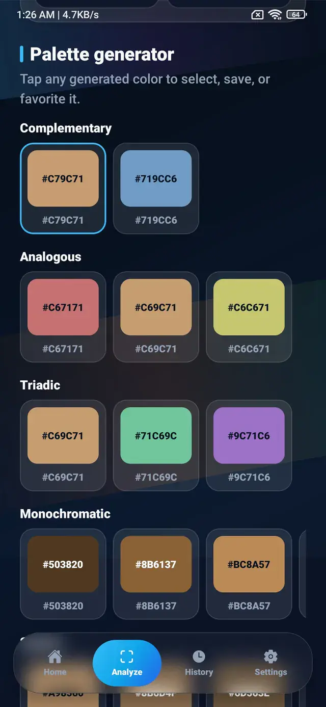
Picking one pixel is useful for an exact reference. Palette extraction answers a broader question: which colors define this image?
A capable palette feature should identify several representative colors, display them as a clear strip, and let users inspect or copy each value. It should also support human editing, because the most frequent pixels are not always the most important colors.
See the guide on creating a palette from an image for a role-based approach to refining generated swatches.
History and favorites
Color work is rarely a one-step task. Users compare several pixels, switch between images, and return to earlier choices. Automatic history reduces the risk of losing a useful value.
Favorites serve a different purpose. They let the user promote selected colors into a smaller, intentional collection. A good app distinguishes temporary exploration from saved decisions.
Useful saved entries should show at least a swatch, color name, and code. Copy and share actions should remain available without reopening the original image.
Manual HEX input
Sometimes the source is already a code. Manual HEX input lets a user inspect #2563EB, find its RGB or HSL equivalent, view a nearby name, or compare it with another color.
Input handling should accept common variations, normalize letter case, and explain invalid values. It should not silently guess when the entered code is incomplete.
This feature turns the app from a photo-only tool into a general color reference.
Contrast checking
A visually attractive color pair may still produce unreadable text. A contrast checker helps users compare foreground and background values before applying them to an interface.
The result should make the tested pair visible, identify which color is foreground, and provide enough context to choose a better alternative. It is especially useful for buttons, labels, body text, navigation, and status messages.
Read how to choose readable text colors for a practical explanation of black, white, and mid-tone backgrounds.
Fast copy and sharing
The app should let users copy the exact value they need without selecting unwanted labels or punctuation. Separate actions for HEX, RGB, HSL, and CMYK reduce cleanup.
Sharing is useful when a color needs review outside the app. A clear shared message can include the swatch name and several representations:
Sky Blue
HEX #38BDF8
RGB 56, 189, 248
HSL 199, 95%, 60%
The receiving person can then use the format that fits their workflow.
CSS variable export
Developers benefit when saved colors can become meaningful CSS custom properties:
:root {
  --color-surface: #0F172A;
  --color-accent: #38BDF8;
  --color-highlight: #EC4899;
}
Export should produce clean, editable text rather than lock values into a proprietary format. Users still need to rename variables according to their project’s conventions.
Offline-friendly processing
On-device image analysis improves responsiveness and supports work when network access is unavailable. It also means gallery and camera images do not need to be sent to a remote service for basic color sampling.
Users should still review the app’s privacy information and platform permissions. Camera access should be requested for taking a photo, while the system image picker can provide access to a chosen gallery item.
ColorSnap describes its on-device behavior in the privacy policy.
Clear, focused interface design
Feature quantity does not guarantee a good experience. The most useful controls should be visible, labels should be understandable, and a selected color should remain the visual focus.
Look for:
- a stable preview that does not jump during selection;
- readable values with copy actions;
- clear distinction between current, historical, and favorite colors;
- responsive controls for one-handed Android use;
- sensible feedback after saving or copying;
- no broken navigation between photo, result, and palette views.
A practical evaluation checklist
Before choosing an app, test a real task:
- Open a detailed screenshot.
- Zoom into a small component.
- Select its center and edge.
- Compare the values.
- Copy the HEX code.
- Save the preferred sample.
- Generate a palette from the same image.
- Test one foreground and background pair.
This short workflow reveals more than a long feature list. It shows whether the app is precise, understandable, and efficient.
How ColorSnap approaches these features
ColorSnap is an Android color identifier app designed around gallery and camera selection, exact tapping, multiple code formats, color names, palettes, favorites, history, contrast checking, and CSS variable export.
The complete ColorSnap features overview explains how these tools work together. For common usage questions, visit the ColorSnap FAQ.
Frequently asked questions
Does a color picker need every color format?
Not every user needs every format, but displaying common formats together makes the result useful across design, development, art, and print-oriented planning.
Is a color name enough for design work?
Use the name for communication and the numeric code for implementation. Names are approximate and can vary between naming systems.
Why are history and favorites separate?
History captures recent exploration automatically. Favorites represent colors the user intentionally wants to keep.
What is the most important feature?
Reliable, precise selection is the foundation. The remaining features should help users understand, organize, and apply that result.
Explore ColorSnap color tools
Start from the ColorSnap homepage or review the complete app features. For focused workflows, learn about the Android color identifier, use the photo color picker, or explore the image palette generator. The ColorSnap FAQ answers common questions about formats, images, saved colors, and app usage.