
Quick answer: A color contrast checker compares a foreground color with a background and returns a ratio. Higher ratios generally make text and essential interface elements easier to distinguish.
What is color contrast?
Color contrast describes the visual difference between two colors. In interface design, it usually refers to the difference between text and its background, although it also matters for icons, borders, focus indicators, charts, and controls.
Black text on white has very strong contrast. Light gray text on white has much weaker contrast. The second combination may look subtle, but it can be difficult to read on a small screen, in bright light, or for a person with reduced visual acuity.
What does a contrast ratio mean?
Contrast is expressed as a ratio ranging from 1:1 to 21:1.
1:1means the colors have the same relative luminance.21:1is the maximum contrast between black and white.
The ratio is calculated from relative luminance, not from a simple difference between RGB channel values. Human vision responds differently to red, green, and blue light, so the calculation applies weighted and linearized values.
Common WCAG contrast targets
The Web Content Accessibility Guidelines provide widely used targets:
- Normal text should generally reach at least
4.5:1. - Large text should generally reach at least
3:1. - Essential non-text interface components should generally reach at least
3:1against adjacent colors. - Enhanced contrast for normal text uses a target of
7:1.
These targets are a baseline, not a guarantee that every design will feel equally readable. Font weight, size, screen quality, lighting, and user needs still matter.
How to check a foreground and background color
Start with the exact color values used in the design.
- Enter or identify the background HEX value.
- Enter the text or foreground HEX value.
- Read the contrast ratio.
- Compare it with the target for the content.
- Test the combination in the real component.
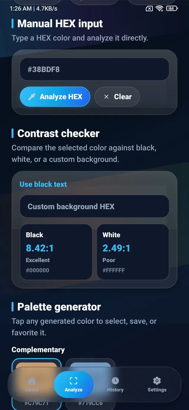
The ColorSnap app can identify a color from a photo or manual HEX input, compare it with black and white, and indicate which text direction provides stronger readability.
For example, a tan background such as #C79C71 may work better with dark text than white text. The checker provides evidence for that choice rather than relying only on visual preference.
How to improve weak contrast
Darken or lighten one color
The simplest approach is to increase the luminance difference. Darken the text or background, or lighten one side of the combination.
Reduce decorative transparency
Text placed at partial opacity blends with its background. A color that passes at full opacity may fail after transparency is applied.
Add a solid surface behind text
Text over a photograph can cross both light and dark areas. A solid or sufficiently opaque surface creates a predictable background.
Increase size and weight carefully
Large, bold text can use a lower target in some WCAG criteria, but increasing size should not be used to excuse weak body-text contrast. Readability should remain the primary goal.
Use a different role for the color
A subtle shade may work well for a border or decorative background but not for text. Keep the color in the palette and assign it a role where contrast is less critical.
Contrast over photographs
Photographs are variable backgrounds. A white heading may be readable over a dark section and disappear over a bright highlight a few pixels away.
Safer approaches include:
- placing text in a consistent area of the image;
- using a solid text band;
- adding a restrained overlay;
- applying a text shadow only as supporting treatment;
- providing a separate surface for essential information.
Test the complete text area, not one sampled pixel.
Contrast is not the same as color-blind accessibility
A strong luminance ratio helps readability, but it does not ensure that two colors are distinguishable by hue alone. Red and green can have adequate text contrast in some combinations while still being difficult to interpret as status categories.
Do not communicate meaning with color alone. Add:
- text labels;
- icons with accessible names;
- patterns or shapes;
- clear state descriptions.
This is especially important for errors, success states, charts, maps, and form validation.
Designing a contrast-aware color system
Document tested foreground pairs beside each surface token:
:root {
  --surface-default: #F8FAFC;
  --text-on-default: #172033;

  --surface-accent: #075985;
  --text-on-accent: #FFFFFF;
}
This makes the safe pairing available to designers and developers without repeating the same decision for every component.
For interactive states, test default, hover, pressed, disabled, focus, and selected appearances. A button may pass in its default state but lose clarity after opacity or color changes.
Practical contrast checklist
- Test exact production colors, including opacity.
- Use the appropriate target for text size and purpose.
- Check icons, borders, focus rings, and form controls.
- Test text across the full area of image backgrounds.
- Pair color with labels or icons when it communicates status.
- Verify mobile screens in bright and dim environments.
- Recheck colors after design-token changes.
A contrast checker turns a subjective visual decision into a measurable starting point. The final review should combine that ratio with real-device testing and clear information design.
Explore ColorSnap color tools
Start from the ColorSnap homepage or review the complete app features. For focused workflows, learn about the Android color identifier, use the photo color picker, or explore the image palette generator. The ColorSnap FAQ answers common questions about formats, images, saved colors, and app usage.