
Quick answer: Choose an image with a clear visual direction, extract its dominant colors, remove near-duplicates, then assign each remaining shade a role such as background, text, primary action, accent, or border.
What is an image color palette?
An image color palette is a selected group of colors derived from a photograph, illustration, screenshot, or other visual reference. It summarizes the image’s color direction in a form that can be copied, saved, and reused.
A good palette does more than list dominant pixels. It preserves useful relationships:
- light and dark contrast;
- warm and cool balance;
- neutral foundation colors;
- one or two distinctive accents;
- enough separation between interface roles.
This makes image palette extraction useful for brand exploration, interface design, social graphics, illustration, presentation themes, and frontend development.
Step 1: Choose an image with a clear purpose
Start by deciding what you want from the image. A landscape may offer natural greens and sky blues. A product photograph may reveal brand accents and neutral surfaces. An interior image may combine wood, fabric, wall, and plant colors.
Images with controlled lighting and a clear subject usually produce more coherent palettes. Busy collages can generate many unrelated shades, while strong filters may push every result toward one color cast.
Ask three questions:
- What is the visual subject?
- Which mood should the palette preserve?
- Where will these colors be used?
Those answers help you judge the extracted result instead of accepting every generated value.
Step 2: Extract the dominant colors
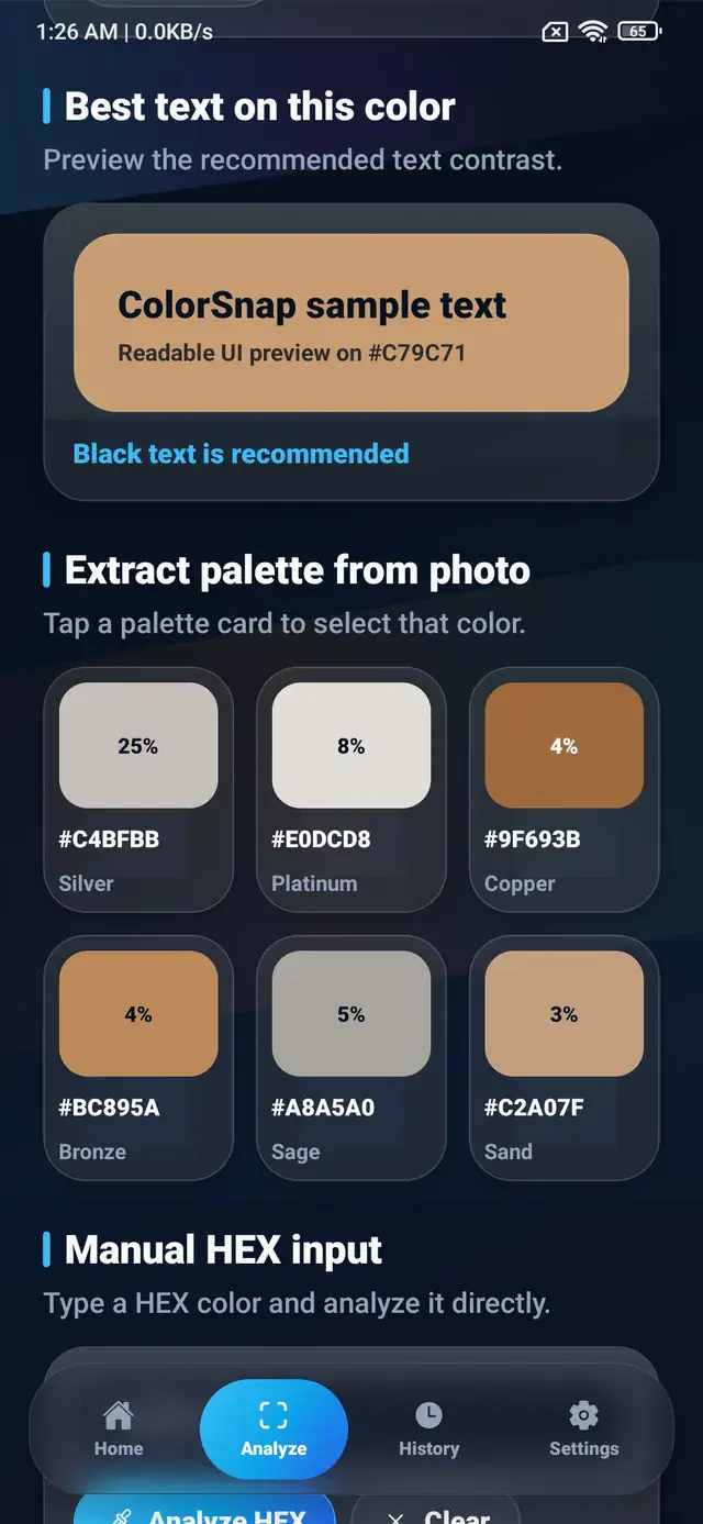
Open the image in an image color palette generator. The ColorSnap app analyzes the selected photo and presents a group of representative colors with HEX codes and readable names.
Dominant colors often include:
- the largest background area;
- the main subject color;
- repeated environmental colors;
- bright highlights;
- dark shadows or structural tones.
The most common color is not always the best primary color. A large neutral wall may dominate the photo, while a smaller orange object provides the identity you actually want.
Step 3: Remove duplicate and accidental shades
Extraction may produce two colors that are visually very close. It can also capture a reflection, shadow, or compression artifact that does not support the intended direction.
Refine the list by:
- combining near-identical neutrals;
- removing colors caused by glare;
- keeping at least one dark and one light option;
- retaining the most recognizable accent;
- checking whether each color has a clear role.
A focused five-color palette is often easier to apply than a long list of minor variations.
Step 4: Assign practical roles
Turn the palette into a system by naming how each color will be used.
For an interface, roles might include:
:root {
  --surface: #F8FAFC;
  --text: #172033;
  --primary: #2878B5;
  --accent: #D97745;
  --support: #6A8F72;
}
For an illustration or social graphic, the same colors may be described as background, subject, highlight, shadow, and detail.
Role-based naming is more durable than names such as blue-1 and orange-2. It explains intent and makes later changes easier.
Step 5: Check contrast before using the palette
An attractive group of colors does not automatically create readable text. Test foreground and background combinations before placing text, icons, controls, or important information.
Dark text often works on pale extracted colors, while white text may need a much darker background than expected. Small text requires stronger contrast than large decorative text.
Use a contrast checker for likely combinations, then verify the result in the actual interface or graphic.
How many colors should a palette contain?
There is no universal number, but three to seven colors covers many practical cases.
- Three colors can define a compact visual identity.
- Five colors can support a background, text, primary, accent, and secondary role.
- Seven colors allow more range for data visualization, illustration, or complex systems.
If the palette grows beyond that, group colors into families and document their purpose.
How to build a palette from a photograph manually
Automatic extraction is a strong starting point, but manual sampling adds control. Tap areas that represent:
- the lightest useful surface;
- the darkest structural color;
- the main subject;
- the strongest accent;
- a supporting natural or neutral tone.
Compare the manual selections with the generated palette. Keep the values that best represent the image and your intended use.
Common palette extraction mistakes
Choosing only bright colors
Bright accents are memorable, but a usable system also needs neutral surfaces and readable text colors.
Ignoring lighting
A warm indoor light can shift every detected pixel. Decide whether you want the photographed mood or an approximation of the object’s base color.
Treating every result as exact
An extracted palette represents the image data. Camera processing, editing, compression, and display profiles can all affect the values.
Skipping real-context testing
Place the colors into a sample screen, graphic, or component. Context reveals whether the palette has enough hierarchy and contrast.
Reusing the palette
Save the selected values, copy their HEX codes, or export them as CSS variables. Keep a link or note identifying the source image so future collaborators understand where the direction came from.
The strongest workflow combines automation with judgment: extract the image’s visual structure, refine the candidates, assign roles, and test the palette where it will actually appear.
Explore ColorSnap color tools
Start from the ColorSnap homepage or review the complete app features. For focused workflows, learn about the Android color identifier, use the photo color picker, or explore the image palette generator. The ColorSnap FAQ answers common questions about formats, images, saved colors, and app usage.