
You tap a beige wall in a photo and read #C8B9A4. You tap again a few pixels to the left and read #CFC0AB. Tap a third time and you get something between the two. Nothing is broken, and you have not made a mistake.
Both readings are correct measurements of different pixels. The wall in your photo is not one color at all. It is thousands of slightly different colors produced by light, camera processing, and file compression. A color picker reports what is actually stored in the image, so the useful question is not which reading is right, but how much of the image you should read at once.
This guide explains what makes the values move, what the exact, average, median, and dominant sampling methods actually do, which sample size suits which subject, and how to build a routine that gives you the same answer twice.
The short answer
A color picker returns different HEX codes from the same object because a photograph stores per-pixel variation rather than a single flat color. Compression, sensor noise, texture, blended edges, and uneven lighting all shift neighboring pixels. Sampling a small area instead of one pixel, and choosing an averaging method that suits the surface, produces a stable and repeatable value.
A color picker reads pixels, not surfaces
Three terms make the rest of this easier to follow.
- Pixel is one stored color value in the image file. In a standard photo it holds a red, green, and blue channel value, which is what a HEX code writes in compact form. If the notation is new to you, the guide on what a HEX color code represents covers it in detail.
- Sample area is the group of pixels a picker reads when you tap. A 1 × 1 area reads one pixel. A 5 × 5 area reads twenty-five.
- Sampling method is the rule used to turn the pixels in that area into a single reported color.
The important consequence: a color picker measures the photograph, not the wall. Everything between the wall and the file is baked into the number you read, including the lens, the sensor, the white balance decision, and the JPEG encoder.
Five reasons the same photo returns different HEX codes
Compression blends neighboring pixels
Baseline JPEG splits an image into 8 × 8 pixel blocks and encodes each block as a set of frequency coefficients. Most encoders also store color information at a lower resolution than brightness. Both steps are lossy, so fine color detail is approximated rather than preserved.
In practice a flat surface picks up faint blocking, and pixels near a strong edge pick up ringing, which appears as light or dark fringes that were never in the scene. Sample inside one of those fringes and you get a value the object never had.
Camera noise adds random variation
Image sensors produce noise. Two adjacent pixels looking at exactly the same patch of wall record slightly different values, and the gap widens in dim light or at high ISO. A single-pixel reading inherits that randomness in full, which is why tapping the same spot twice in a low-light photo can move the HEX code by several steps per channel.
Texture contains many real colors
Fabric, wood grain, brick, foliage, and painted plaster are not flat. A knitted sweater that reads as navy contains bright thread highlights, dark gaps between the fibers, and everything in between. Here the variation is not an artifact at all. The picker is correctly reporting that the surface has range, and what you usually want is one value that represents that range fairly.
Edges are blended, not solid
Any boundary between two objects contains blended pixels. Interface screenshots add antialiasing on purpose so curves and text look smooth, and resizing an image creates the same effect everywhere. A button filled with #2563EB will have edge pixels that mix the fill with whatever sits behind it.
This is the most common cause of a confusing reading. The sample looked like it landed on the button, but part of the sample area was sitting on the edge.
Light falls unevenly across one surface
A wall lit from a window is brighter near the window. A curved object has a lit side, a shaded side, and often a specular highlight that carries the color of the light source rather than the color of the object. Those are genuinely different colors in the image, and no sampling setting will merge them into one true value. The decision you actually have to make is which part of the surface you want to describe.
Exact, average, median, and dominant sampling explained
Four common method names cover the ways a picker can turn a group of pixels into one color, and each answers a different question.
| Method | What it returns | Best for | Watch out for |
|---|---|---|---|
| Exact | The single pixel under the target | Flat digital graphics, screenshots, vector art | Inherits noise and compression artifacts in photos |
| Average | The arithmetic mean of every pixel in the area | Smooth, evenly lit surfaces | One bright highlight or dark speck shifts the result |
| Median | The middle value rather than the mean | Textured surfaces and noisy photos | Needs a large enough area to have a meaningful middle |
| Dominant | The color covering the most pixels in the area | Mixed areas where one color should win | Can ignore a minority color you cared about |
The distinction between average and median matters more than it sounds. Suppose a 5 × 5 sample of dark green foliage catches one blown-out highlight. An average pulls the whole reading toward that highlight and produces a green lighter than anything visible in the leaf. A median treats it as an outlier and returns a value much closer to the leaf itself.
Dominant behaves differently again. It does not compute a blend. It reports the color that occupies the most pixels, so on a logo printed over a photo, dominant sampling tends to return the logo color rather than a muddy mix of logo and background.
What sample size should you use?
For photographs, a 5 × 5 pixel area is a dependable default. It reads twenty-five pixels, which is enough for noise to cancel out, and it stays small enough to sit comfortably inside a single surface at normal zoom.
Adjust from there based on what you are sampling:
- 1 × 1 for flat digital graphics: interface screenshots, exported design assets, vector illustrations, and solid color swatches. There is no noise to average away, so averaging only risks pulling in an antialiased edge.
- 3 × 3 for small targets, thin strokes, and anything within a few pixels of a boundary. Enough smoothing to help, small enough to stay clear of neighboring colors.
- 5 × 5 for general photography. This is the standard working size.
- Larger areas for coarse texture such as fabric, gravel, tree bark, or foliage, where you want a representative value rather than one fiber.
Sample shape matters at the margins. A square area is predictable and easy to reason about, but a different footprint can be easier to keep inside a narrow shape such as a stem, a cable, or a strip of trim. If your tool offers a shape control, reach for it when the target is long and thin rather than broad and flat.
Size has a limit in the other direction too. Once the sample area is wide enough to cross onto a second surface, a larger area stops helping and starts averaging two different objects together.
Where these settings live in ColorSnap
ColorSnap keeps sampling behavior in one place rather than hiding it behind the picker. Its Settings screen has a Smart Sampling section with controls for method, size, and shape, and the app’s own description is direct about the trade-off: exact mode reads one pixel, while the average, median, and dominant modes inspect a nearby area for a more stable result.
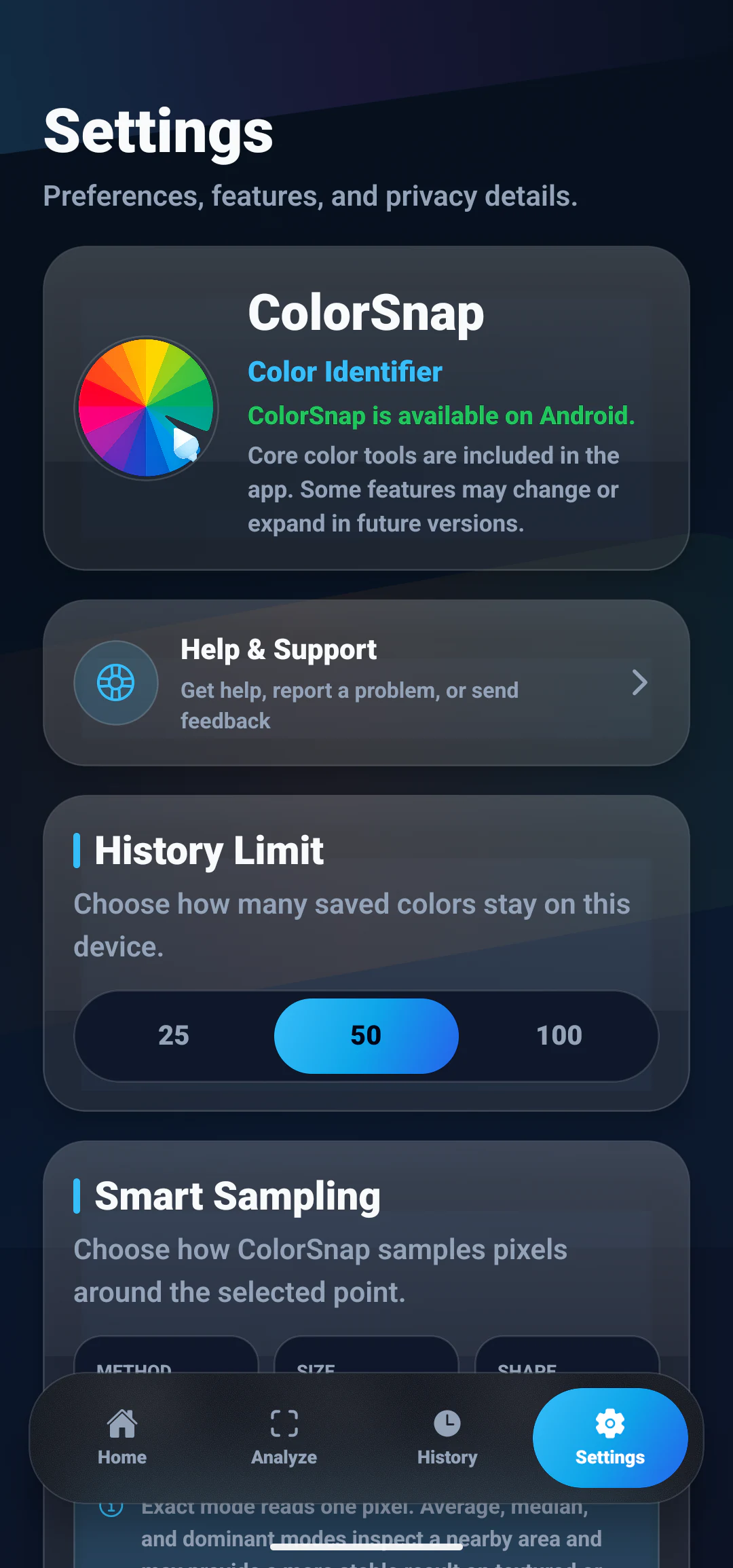
The app uses a 5 × 5 pixel sample area by default and marks that size as the recommended one. On the Analyze screen the current area is drawn as a movable box over the image and labeled with its size, so you can see which pixels are about to be read before committing to a value. The photo color picker page walks through that selection step, and the full feature list covers what happens to the color afterward.
A repeatable routine for sampling a color from a photo
Consistency comes from doing the same six things every time.
- Start from the best available file. Use the original image rather than a copy that has been through a messaging app. Re-compression and downscaling both add edge blending that was not in the original.
- Zoom in before you aim. Magnification does not change the stored pixels, but it makes it far easier to keep the sample area away from edges and highlights.
- Pick a representative patch, not a striking one. Avoid the brightest highlight and the deepest shadow. Choose a part of the surface that looks like the color you would describe to someone else.
- Match the method to the surface. Exact for rendered graphics, average for smooth surfaces, median or dominant for texture.
- Take three samples, not one. Read the same surface in three separate places. If the three values are close, you have a trustworthy color. If they are far apart, the surface has real range and one value will not describe it.
- Save the one you keep. A value that exists only in your clipboard is gone the moment you copy something else.
Step five is the one people skip, and it is the one that turns a guess into a measurement. Three close readings are evidence. One reading is an anecdote.
Keep a record of how each color was sampled
Two HEX codes are only comparable if they were measured the same way. A #2F6B4A read as a single pixel and a #2F6B4A read as a 5 × 5 median came from different processes, and knowing that changes how much you should trust the match.
ColorSnap records this alongside the color. Each entry in the saved list carries the color name, the HEX value, the sampling badge, and the time it was taken, so a saved green reads as Emerald, #00A28A, 5 × 5 Average rather than as a bare code with no history.
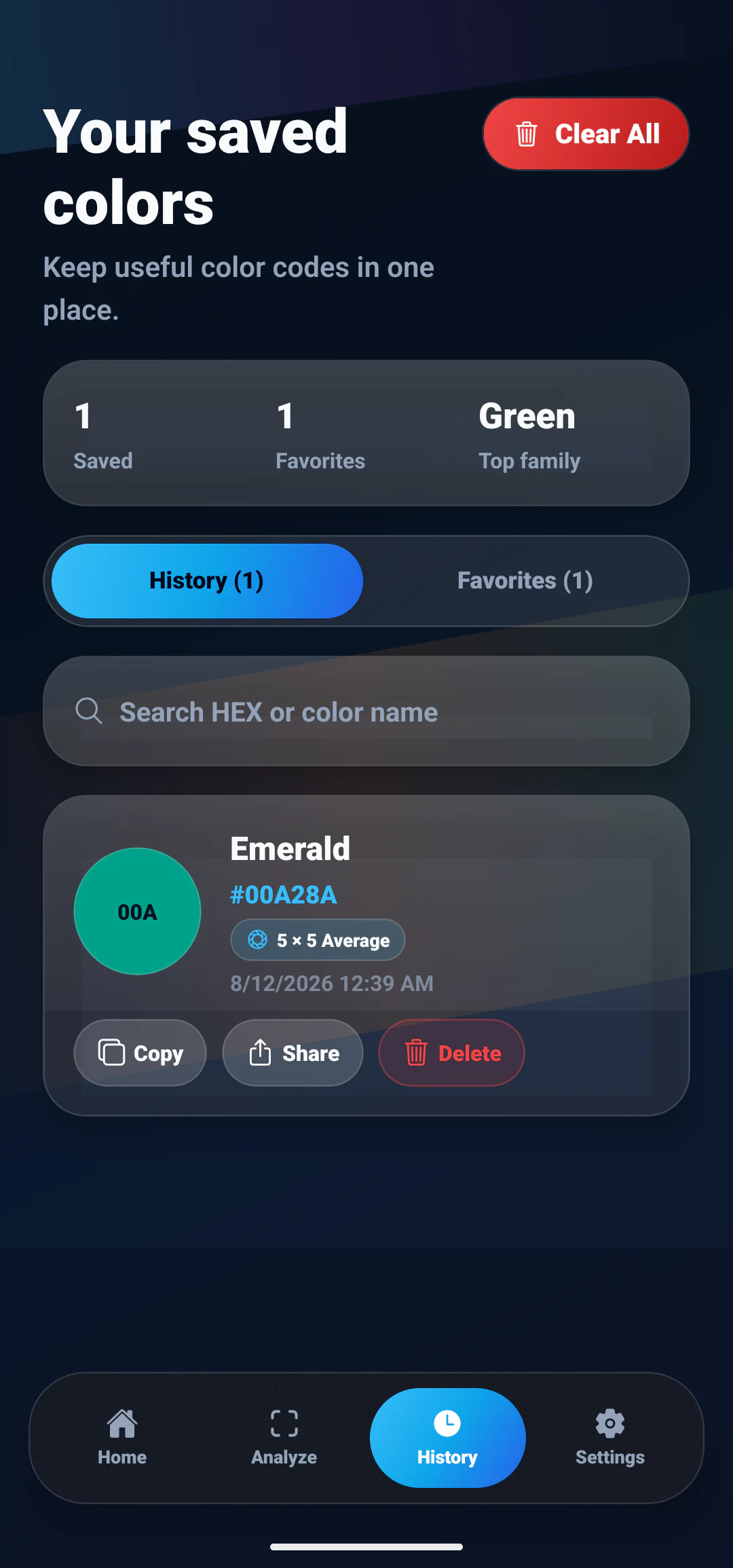
Saved colors are searchable by HEX or by color name, which is what makes the three-sample habit practical. Take several readings of the same surface, compare them side by side later, and delete the ones that turned out to sit on an edge. The history list is capped on the device, so the reading you decide to keep is worth marking as a favorite rather than leaving it to be pushed out by newer samples.
If the color is heading into an interface, that saved value is also the input for a contrast check. The color contrast checker guide explains how to test it against the text that will sit on top of it.
When a stable sample still is not the object’s color
Repeatable sampling solves the variation problem. It does not solve the identity problem.
A photo taken under a warm bulb stores warm pixels. Sample it perfectly, with a well-chosen method and a clean patch, and you get a precise, repeatable reading of a white wall that looks beige, because in that image it is beige. White balance, exposure, screen calibration, and the color profile of the file all sit between the object and your HEX code.
That is fine for the work most people are doing: interface references, digital art, mood boards, palette building, and design handoff. It is not sufficient for paint matching, textile production, or print color control, which need physical samples, controlled lighting, and calibrated measurement rather than a photograph. When you are sampling real objects instead of digital files, the camera color identifier guide covers the lighting and distance decisions that shape what ends up in the image in the first place.
Getting a color you can rely on
The variation is not a defect in the tool. It is a property of photographs. Compression, noise, texture, blended edges, and uneven light all move the numbers, and once you can name those causes the settings stop feeling arbitrary. Choose a sample area wide enough to smooth out noise and narrow enough to stay on one surface, pick a method that suits what you are sampling, take more than one reading, and keep a record of how you took it.
For the step-by-step version of the selection itself, see how to identify a color from a photo, or browse the rest of the photo color picker guides.
Explore ColorSnap color tools
Start from the ColorSnap homepage or review the complete app features. For focused workflows, learn about the Android color identifier, use the photo color picker, or explore the image palette generator. The ColorSnap FAQ answers common questions about formats, images, saved colors, and app usage.
Frequently Asked Questions
Is a single-pixel sample more accurate than an averaged one?
A single pixel is the most literal reading, not automatically the most accurate one. In a photograph, one pixel carries compression artifacts and sensor noise, so an averaged or median reading across a small area usually represents the surface better. Single-pixel sampling is the right choice for flat digital graphics such as interface screenshots and vector exports.
What sample size should I use in a color picker?
A 5 × 5 pixel area is a reliable default for photographs: wide enough to cancel out noise, narrow enough to stay inside one surface. Use 1 × 1 for flat digital graphics, and increase the area for coarse textures such as fabric, stone, or foliage. Reduce it again when the target is small or close to an edge.
Does zooming into a photo change the sampled color?
Zooming mainly changes what you can aim at. The real benefit is precision: at higher magnification it is much easier to keep the sample area inside a single surface and away from edges, highlights, and shadows, which is where most inconsistent readings come from.
Why do screenshots give cleaner color samples than photos?
A screenshot is rendered directly by the device, so a flat interface color is stored as one exact value with no lens, no sensor noise, and no exposure decisions. Photographs pass through all three plus lossy compression. A screenshot loses that advantage once it has been resized or re-compressed, which messaging apps often do.
Which sampling method works best on textured surfaces?
Median or dominant sampling usually beats a plain average on texture, because a few very light or very dark pixels, such as a highlight on a thread or a gap between fibers, pull an average away from the color you actually see. Pairing either method with a slightly larger sample area helps further.
Can I tell later how a saved color was sampled?
Only if the tool records it. ColorSnap stores the sample size and method alongside each saved color, so an entry in the history list reads something like 5 × 5 Average next to its name and HEX value. That makes it possible to tell whether two saved colors were measured the same way.