
How to Create CSS Color Tokens From a Photo
Turn photo colors into reusable CSS color tokens. Follow a worked example with semantic names, accessible text pairs, button states, and a dark theme.
Colors in this guide
A photo can give you a convincing green, a warm background, and a dark neutral. Pasting those HEX codes into a stylesheet is easy. Keeping them consistent across buttons, cards, links, and a second theme takes another step: deciding what each color is for.
CSS color tokens give those decisions names you can reuse. Instead of copying a green into twelve selectors, you define an action color once and let the relevant components reference it. When the green changes, the decision stays easy to find.
This guide starts where palette extraction ends. You will turn a small set of values into raw color references, map those references to interface roles, build a button, and adapt the roles for dark mode. The examples are hand-written CSS you can use with any photo color picker; no token package or build tool is required.
Quick answer: how do you create CSS color tokens?
Sample a few useful photo colors and save their exact values. Declare the values as CSS custom properties, then create semantic names such as --color-text and --color-action that reference them. Use those names in components with var(). Adjust colors for readable contrast and define separate theme mappings where necessary. The photograph supplies the starting palette; the interface determines its final roles.
What is a CSS color token?
A color token is a named design decision that stores or references a color. In a CSS implementation, --palette-green: #00A28A stores a value, while --color-action: var(--palette-green) assigns that value a job.
Two layers are useful here:
- Primitive tokens describe the available values, such as green, dark green, and white.
- Semantic tokens describe their purpose, such as action background, button label, and page text.
This separation lets a button keep using --color-action even when a theme changes its underlying green. A small project can start with semantic tokens alone; use two layers when shared values and multiple themes make the distinction helpful.
Design-token exchange has also become more concrete. The Design Tokens Community Group released its first stable specification, version 2025.10, in October 2025. That specification addresses exchanging decisions between tools. The format report is a Community Group specification, not a W3C Standard. A CSS file remains a practical place to begin if your immediate destination is a website.
1. Keep the sample and the design decision separate
Choose a photo with a clear subject and sample a few distinct areas. You need enough variety to explore an accent, a light surface, and a dark anchor. You do not need a token for every visible shade. If you have not collected the swatches yet, follow the guide to creating a palette from an image.
Record the original values before editing them. A useful note might read: “Leaf reference, sampled green #00A28A; darkened for a button with white text.” This preserves the distinction between what you collected and what you chose to ship.
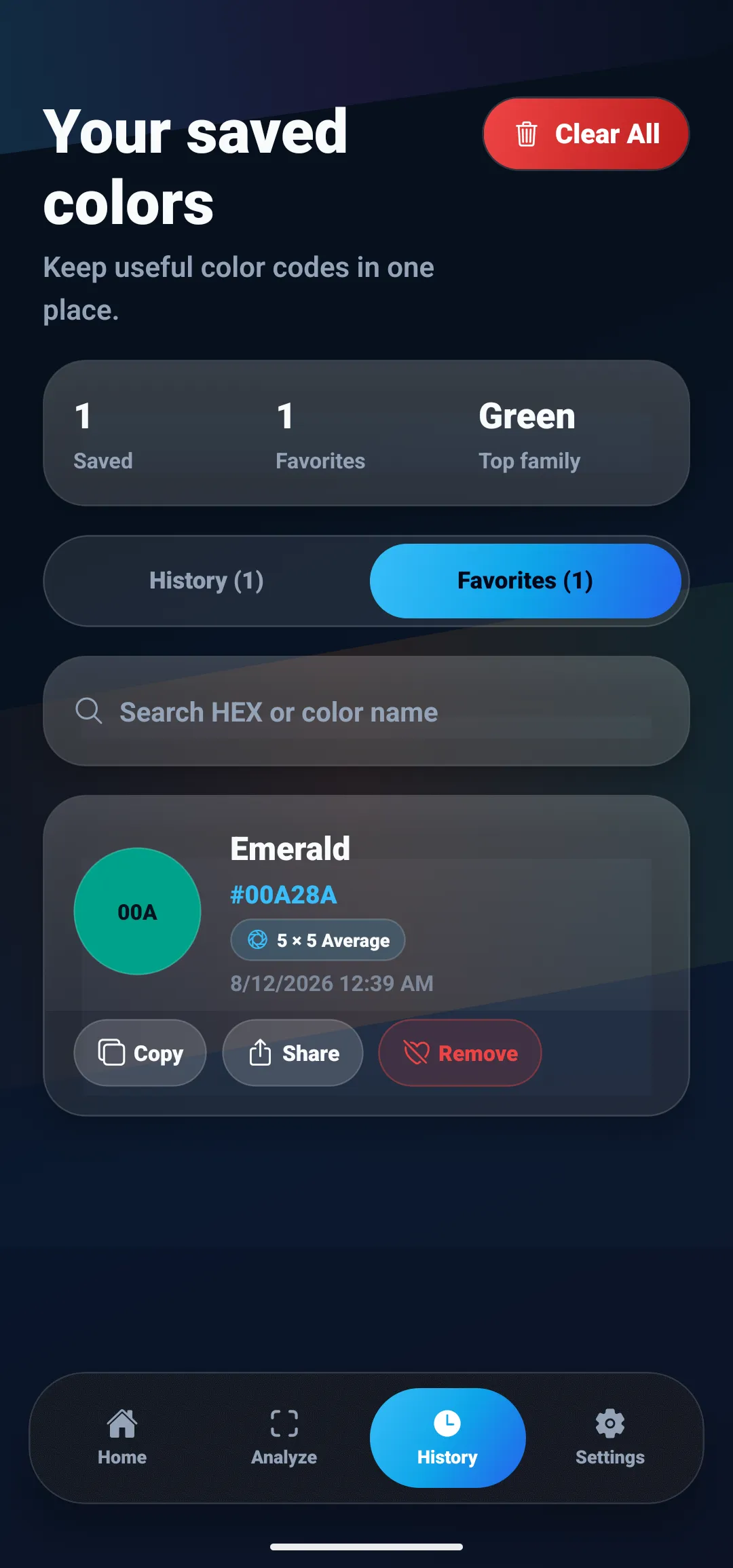
In ColorSnap, the Favorites screenshot at the top of this guide shows an Emerald entry with #00A28A and Copy, Share, and Remove actions. Favorites can hold the values you want to keep while you work out their roles in a separate stylesheet or project note. The app’s nearest color name helps you recognize the swatch; use the numeric code when implementing it.
Be careful when a result also suggests a nearby framework color:
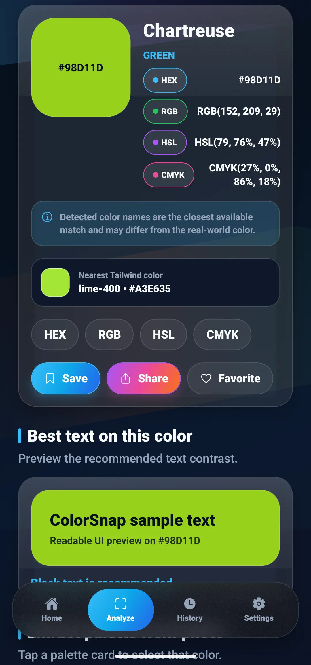
The rest of this example uses Emerald #00A28A as the starting reference. The darker greens and neutral colors below are deliberate example choices, not additional colors claimed to come from that screenshot.
2. Choose roles before writing component styles
Start with a small interface: a page containing a white card, text, and a primary button. Its initial requirements are straightforward:
| Role | Example value | Reason for the choice |
|---|---|---|
| Canvas | #F8FAFC |
A light page background |
| Surface | #FFFFFF |
A separate card surface |
| Main text | #0F172A |
Dark text on the light surfaces |
| Muted text | #475569 |
Supporting copy with readable contrast |
| Primary action | #007A68 |
A darker relative of the sampled green |
| Text on action | #FFFFFF |
A tested foreground for the action fill |
| Action hover | #006354 |
A distinct darker interaction state |
These roles are decisions about the interface. A photograph does not tell you which swatch should be a button, and its most frequent color may be unsuitable for text.
Notice that the table uses separate roles for main text and text on an action. One universal text token cannot reliably cover white cards and dark green buttons.
3. Define the values and semantic aliases
Put this example in a shared stylesheet loaded before your component styles:
:root {
  /* Reference values, including the original sample. */
  --palette-green: #00A28A;
  --palette-green-dark: #007A68;
  --palette-green-deep: #006354;
  --palette-white: #FFFFFF;
  --palette-slate-50: #F8FAFC;
  --palette-slate-600: #475569;
  --palette-slate-900: #0F172A;

  /* Interface roles. */
  --color-canvas: var(--palette-slate-50);
  --color-surface: var(--palette-white);
  --color-text: var(--palette-slate-900);
  --color-text-muted: var(--palette-slate-600);
  --color-action: var(--palette-green-dark);
  --color-on-action: var(--palette-white);
  --color-action-hover: var(--palette-green-deep);
  --color-focus: var(--palette-green-dark);
}
The primitive names above are local project names, not a claim that the values belong to a particular framework scale. Pick a convention your team can maintain.
The CSS Custom Properties specification defines declarations beginning with -- and references through var(). Declaring shared values on :root makes them available through inheritance unless a more local declaration overrides them.
ColorSnap’s documented features include CSS variable export. You can use exported values or copied codes to start this file, then review and rename them yourself. The semantic layers in this guide are project code; the screenshots do not demonstrate an automatic semantic-token generator.
4. Apply tokens to a real component
Use the role names where the actual styles are defined:
body {
  background-color: var(--color-canvas);
  color: var(--color-text);
}

.reference-card {
  background-color: var(--color-surface);
  color: var(--color-text);
}

.reference-card__note {
  color: var(--color-text-muted);
}

.primary-button {
  background-color: var(--color-action);
  color: var(--color-on-action);
  border: 2px solid transparent;
  border-radius: 0.5rem;
  padding: 0.75rem 1rem;
  font: inherit;
  cursor: pointer;
}

.primary-button:hover {
  background-color: var(--color-action-hover);
}

.primary-button:focus-visible {
  outline: 3px solid var(--color-focus);
  outline-offset: 3px;
}
Use .primary-button on a native <button> with a descriptive label. Keyboard focus needs its own visible treatment; a hover color alone does not provide it. This example assumes the focus outline sits against the light page or card surface. Check it again if the button moves onto another background.
To see whether the naming works, change --color-action once. Every primary button should follow that change. If a component still contains an unrelated hardcoded green, decide whether it represents a separate role or an accidental duplicate.
5. Test color pairs, not isolated swatches
A token cannot pass a contrast test on its own. Contrast depends on the foreground and background together.
For this example, the WCAG relative-luminance calculation gives these approximate ratios for opaque sRGB colors:
| Foreground | Background | Contrast ratio |
|---|---|---|
White #FFFFFF |
Sampled green #00A28A |
3.21:1 |
White #FFFFFF |
Action green #007A68 |
5.27:1 |
White #FFFFFF |
Hover green #006354 |
7.21:1 |
Dark text #0F172A |
Sampled green #00A28A |
5.56:1 |
WCAG’s minimum text-contrast criterion requires at least 4.5:1 for ordinary text and 3:1 for qualifying large text, with specified exceptions. The original green therefore falls short for an ordinary white button label. Darkening the fill is one solution; retaining the sample and using dark text is another.
The ratios are rounded for display. Test using unrounded values, especially near a threshold. Opacity, overlays, and background images can change the rendered pair. A passing label pair also does not establish accessibility for the whole button or page. The color contrast checker guide explains the calculation in more depth.
Keep semantic status colors separate from decorative accents. If you add a success message, include meaningful text or an icon with an accessible label rather than relying on green alone. WCAG’s Use of Color guidance explains this distinction.
6. Change the mapping for dark mode
Keep component selectors stable and override the role values. Add the following after the light-theme declarations to follow the user’s light or dark theme preference through prefers-color-scheme:
@media (prefers-color-scheme: dark) {
  :root {
    --color-canvas: #07111F;
    --color-surface: var(--palette-slate-900);
    --color-text: var(--palette-slate-50);
    --color-text-muted: #CBD5E1;
    --color-action: var(--palette-green);
    --color-on-action: var(--palette-slate-900);
    --color-action-hover: #23BFA5;
    --color-focus: var(--palette-green);
  }
}
The original green returns here as a button fill with dark text. That pair has about 5.56:1 contrast. The semantic action role stays the same while both the fill and label mapping change.
Check every state on both the canvas and card surface. A theme needs deliberate pairings; inverting the original HEX codes will not produce them. If your site already has a manual theme control, put these overrides under its existing theme selector instead of adding a competing theme mechanism.
What should you keep with the finished tokens?
Store the CSS in the same version-controlled project as the components that use it. Keep a short note containing the source image reference, original sample, intentional adjustments, and tested foreground/background pairs. When several people edit colors, that record explains why the button green differs from the photographed leaf.
Avoid names tied to location, such as --homepage-left-green. A role such as --color-action remains useful when the layout changes. Add component-specific tokens only when a component has a distinct need; a small card does not require its own copy of every shared color.
Before shipping, inspect one representative screen in each theme, tab through its controls, and check text, focus, hover, and any additional states your interface supports. Keep the reference palette compact and the decisions explicit. If you still need source values, the photo color picker workflow covers collecting them before you return to the stylesheet.
Questions
Frequently asked questions
How do I turn colors from a photo into CSS variables?
Sample or extract a small set of colors, record their HEX values, and declare them as custom properties in a :root rule. Create semantic aliases for uses such as text, surface, and action. Apply those aliases with var() and test each foreground and background combination in a real component.
What is the difference between a color palette and color tokens?
A palette is a collection of swatches. Color tokens give those values stable names and, for semantic tokens, specific interface roles. Several components can use the same token, so changing one definition updates their shared color decision.
Should CSS color tokens use HEX, RGB, HSL, or OKLCH?
Use the notation that fits your project. Six-digit HEX is convenient for copied photo samples; RGB can help with channel and opacity work; HSL and OKLCH can help when developing related colors. Changing notation does not make a sampled color more accurate or guarantee readable contrast.
Can I use the same color tokens in light and dark mode?
Keep semantic names such as --color-text and --color-action consistent, but assign values appropriate to each theme. A green that works as a light-theme button fill may need a different value when used as a link on a dark surface. Test both themes separately.
Can ColorSnap export a complete design-token system?
ColorSnap supports CSS variable export and copying color codes. Treat those values as a starting point: semantic naming, component states, theme mappings, and accessibility checks belong in your project. This workflow does not require or assume DTCG JSON export from the app.
Explore ColorSnap color tools
Start from the ColorSnap homepage or review the complete app features. For focused workflows, learn about the color identifier for Android and iOS, use the photo color picker, or explore the image palette generator. The ColorSnap FAQ answers common questions about formats, images, saved colors, and app usage.