
You rarely start with nothing. You start with one color: a brand blue that already exists, a green sampled off a product photo, or a HEX value a client sent in an email. What you need is three or four more colors that look like the same person chose them.
Guessing works often enough to be dangerous. Two swatches can look fine side by side and still collapse the moment one becomes a page background and the other becomes body text.
There is a more reliable approach. Treat the color you already have as a coordinate, then move a measured distance from it. This guide covers the four relationships that produce most usable schemes, how to expand a scheme into a full palette with tints and shades, how to assign roles so the result survives a real layout, and the mistakes that make a technically correct palette still look wrong.
The short answer
Convert your color to HSL and rotate the hue while holding saturation and lightness steady. A rotation of 180° gives a complementary pair, ±30° gives an analogous set, and three points spaced 120° apart give a triadic scheme. Keep the hue fixed and step the lightness instead for a monochromatic range. Then mix the base toward white and black for tints and shades, and let neutrals carry most of the layout.
Why HSL is the right place to work
A HEX code is a storage format. #C69C71 tells you there is more red than green and more green than blue, but it gives you nothing to turn. HSL describes the same color as three properties you can actually reason about: hue as a position on a 360° wheel, saturation as how much of the color is present, and lightness as how close it is to white or black.
That tan converts to roughly hsl(30, 43%, 61%). Now the palette question becomes arithmetic. Every harmony rule below is a hue rotation with saturation and lightness held still, which is exactly why the resulting colors feel related rather than random. If the three components are new to you, the guide on HEX, RGB and HSL formats explains how the same color moves between notations.
Holding saturation and lightness constant matters as much as the rotation itself. Two colors with the same lightness read as equally important, which is useful when you want a balanced pair and a problem when you need one of them to recede.
Four relationships that cover most palettes
The examples below all start from the same base, #C69C71, so you can see how far each rule travels from it.
Complementary: one hue rotated 180°
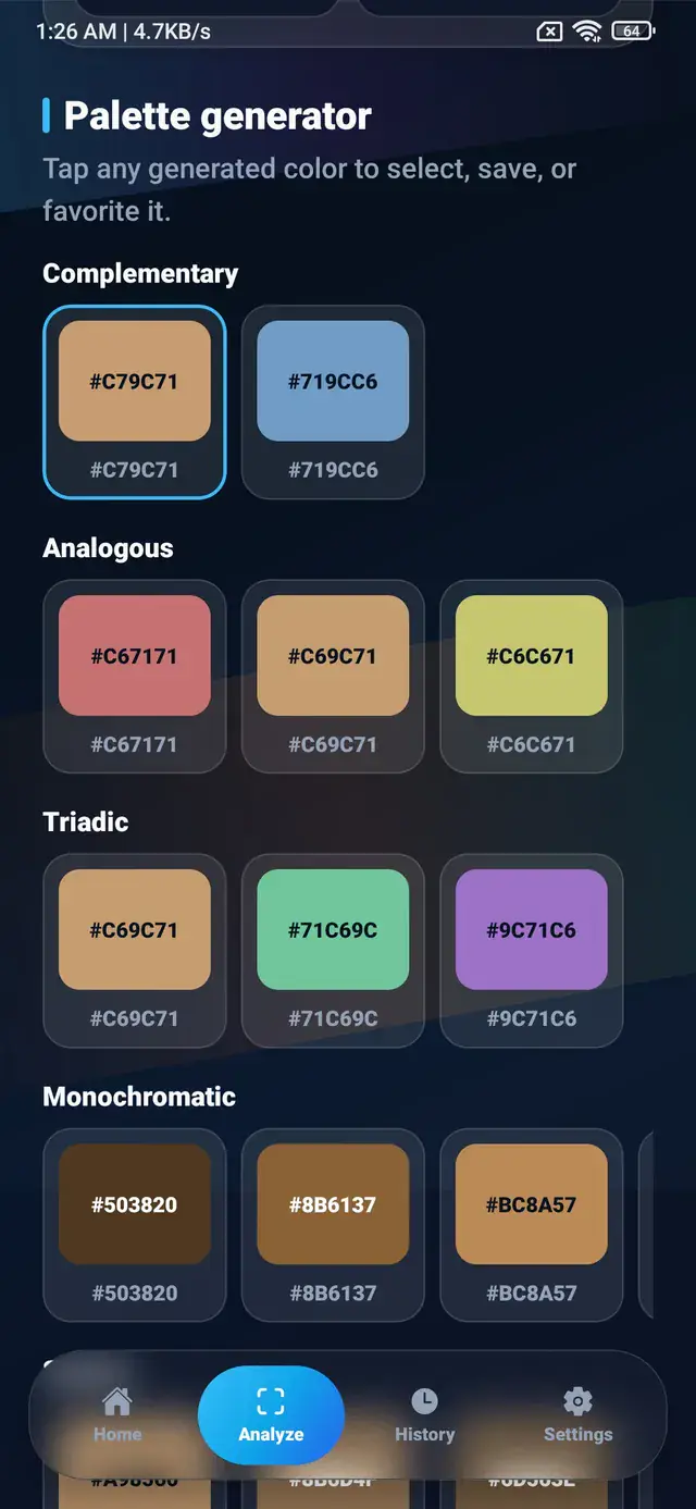
Rotating hsl(30, 43%, 61%) by 180° lands on hue 210 and produces #719CC6, a soft blue with identical saturation and lightness. This is the largest hue difference available, which makes complements excellent for a single element that must stand out and difficult to use across two large areas at once.
Analogous: the neighbors at ±30°
Rotating 30° in each direction gives #C67171, the original #C69C71, and #C6C671. All three share a warm temperature, so the set reads as one family with variation rather than as three decisions. Analogous schemes are the quiet default for backgrounds, cards, and anything covering a lot of screen.
Triadic: three hues 120° apart
Three evenly spaced points produce #C69C71, #71C69C, and #9C71C6 — tan, mint, and lilac. Triadic sets are lively and hard to balance, because all three colors arrive with equal strength. They work when one hue clearly leads and the other two are reduced to accents.
Monochromatic: one hue, several lightness levels
Keep hue 30 and saturation 43%, then step the lightness: 22% gives #503820, 38% gives #8B6137, and 54% gives #BC8A57. No new hue enters the palette at all. Monochromatic ranges are the most forgiving option and the one most people skip, even though a strong interface palette is usually monochromatic with one or two accents borrowed from another rule.
| Scheme | How it is built | Character | Best used for | Main risk |
|---|---|---|---|---|
| Complementary | Base hue + 180° | High tension, strong separation | A single accent against a dominant color | Both colors fighting for the same attention |
| Analogous | Base hue ±30° | Calm, unified, low contrast | Backgrounds, surfaces, illustration | Too little separation between elements |
| Triadic | Three hues 120° apart | Energetic, playful | Categories, charts, illustration | Equal weight makes it feel busy |
| Monochromatic | One hue, stepped lightness | Ordered, restrained | Interface layers and hierarchy | Flat or dull without an accent |
Tints and shades finish the palette
Four or five hues is a scheme, not a palette. Real work needs the values in between: a slightly lighter surface for a card, a darker border, a hover state that reads as the same color under pressure.
Two mixes produce all of them. Blend the base toward white in fixed steps for tints, and toward black for shades. Fixed steps beat hand-tuning because the spacing stays even, so the range behaves predictably when you later assign steps to specific roles. A base mixed 15%, 30%, 45%, 60%, and 75% toward each end gives ten derived values from a single starting color.
Tints and shades also solve the dark mode problem. The same hue needs a different lightness on a dark surface than on a white one, and having the range already built means picking a different step rather than inventing a new color.
Turn the scheme into a working palette
A harmony rule tells you which colors are related. It says nothing about how much of each to use, and that is where most one-color palettes fail.
Give every color a job before you open a design file:
- Dominant. The color that covers the most area, usually a light tint or a dark shade rather than the saturated base.
- Supporting. Cards, sections, and secondary surfaces, typically one or two steps from the dominant.
- Accent. Buttons, links, active states, and anything that must be found quickly. This is where a complementary hue earns its place.
- Neutrals. Text, borders, dividers, and disabled states.
A common working split is roughly 60% dominant, 30% supporting, and 10% accent. Treat it as a starting proportion rather than a rule; the value is in forcing a hierarchy instead of using three colors equally.
Neutrals deserve more attention than they usually get. Rather than reaching for pure grey, keep the base hue and drop saturation to somewhere between 4% and 10%, then vary lightness. A neutral built from hue 30 stays faintly warm and sits with the rest of the palette in a way that #808080 never quite does. For the wider question of building these roles into a full app color system, the guide on color palette ideas for app design works through several complete examples.
Check the combinations you will actually ship
Harmony rules describe relationships between hues. They make no promise about legibility, and a palette that is theoretically correct can still produce text nobody can read.
Test the pairs that will carry words: body text on the dominant surface, text on cards, and label text on the accent. WCAG sets 4.5:1 as the minimum contrast ratio for normal body text and 3:1 for large text, and a saturated mid-lightness color frequently misses both. When a pair fails, adjust lightness rather than hue so the relationship you built survives the fix. The color contrast checker guide covers how the ratios are calculated and what to do when a brand color simply cannot pass.
Generating harmonies from one HEX value
ColorSnap builds these relationships from whatever color is currently selected. On the Analyze screen you can type a HEX value directly into the manual input, and the Palette generator section then lists complementary, analogous, triadic, and monochromatic sets alongside shade and tint ranges for the same base. The screen’s own instruction is the useful part of the workflow: tap any generated color to select, save, or favorite it, which means a generated swatch becomes a new base color for further exploration in one tap.
The values in this article came from that screen. A tan base produced the blue complement at #719CC6, the analogous pair at #C67171 and #C6C671, the triadic partners at #71C69C and #9C71C6, and a monochromatic run from #503820 up to #BC8A57.
Nothing about the process requires typing a value by hand. A color sampled from a photo works the same way, which is the practical bridge between an image and a scheme: pull one strong color out of a picture, then derive the rest arithmetically instead of hunting for four more colors in the same photo. The image palette generator page covers the extraction side of that workflow, and how to create a color palette from an image walks through choosing which extracted color deserves to be the base.
Keep the values you settle on
A palette that exists only in a clipboard is one copy away from being lost. Derived colors are especially easy to lose, because you cannot recover #71C69C by remembering that it was “the mint one”.
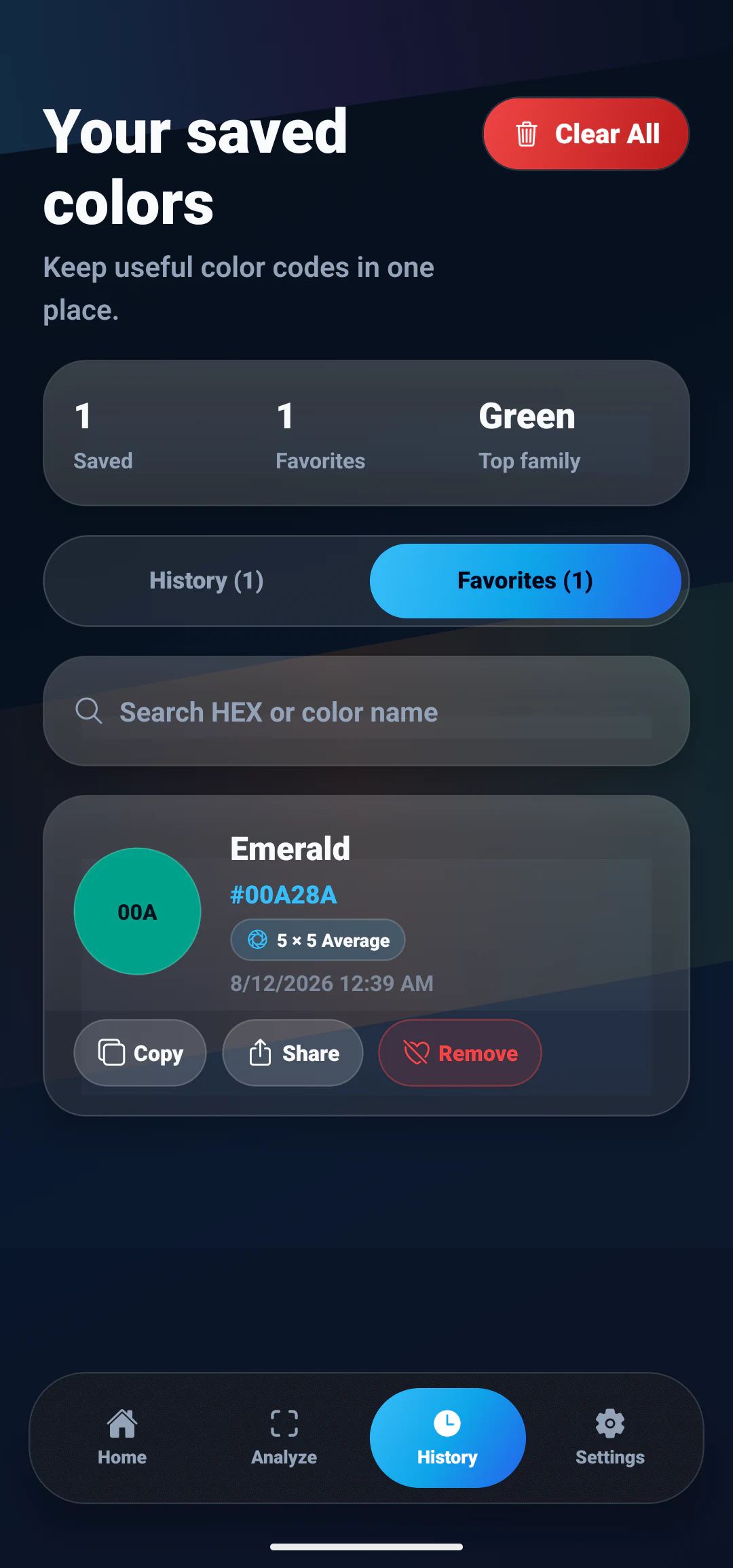
Saved colors keep their name and value together, so a palette stays readable weeks later. When the colors are ready to leave the device, the Analyze screen can copy the current palette — the selected color plus any palette extracted from an image — as plain text, JSON, or CSS variables, which drops straight into a stylesheet as --color-1, --color-2, and so on.
Five ways a one-color palette goes wrong
Every color at the same lightness. Rotating hue while holding lightness produces colors of equal visual weight, which is correct arithmetic and poor hierarchy. Once the scheme exists, change lightness deliberately so one color leads.
A complement used at full strength across large areas. Complementary pairs are built for contrast. Two saturated opposites covering half the screen each will vibrate along their shared edges. Reduce one, or reserve the complement for accents.
No neutrals at all. A palette of four hues and no greys forces every element to be colorful. Text, borders, and disabled states need somewhere quiet to live.
A base color that was never reliable. If the starting HEX came from a photo, an unstable sample sends every derived color off with it. Sampling the same surface two or three times before committing is the cheapest insurance available, and why a color picker gives different HEX codes explains what causes the variation.
Judging swatches instead of layouts. Colors in a row are evaluated against each other. Colors in an interface are evaluated against area, spacing, and text. Put the palette into something real before deciding it works.
Where to go from here
One color plus a rotation, a lightness range, and a set of roles is enough to build a palette that holds together. The arithmetic is the easy half; the decisions about proportion and hierarchy are what separate a scheme from a design.
Start with the color you already have, generate the four relationships, and keep only the values you can assign a job to. A palette of five colors you can name the purpose of will outperform twelve colors that merely look pleasant together.
Explore ColorSnap color tools
Start from the ColorSnap homepage or review the complete app features. For focused workflows, learn about the Android color identifier, use the photo color picker, or explore the image palette generator. The ColorSnap FAQ answers common questions about formats, images, saved colors, and app usage.
Frequently Asked Questions
What is a complementary color?
A complementary color sits directly opposite another color on the hue wheel, 180 degrees away. If a warm tan reads as roughly hsl(30, 43%, 61%), its complement is at hue 210, a soft blue of the same saturation and lightness. The pair carries the strongest hue difference available, which is why complements draw attention when used sparingly and feel loud when both colors cover large areas.
Is a complementary or analogous scheme better for a user interface?
Analogous is usually the safer choice for an interface because neighboring hues share a temperature and stay calm across a full screen. Complementary works best when one color is clearly dominant and the opposite hue appears only on the elements that need attention, such as a primary button or an active state. Many interfaces end up analogous with a single complementary accent.
How do I make lighter and darker versions of one color?
Mix the color toward white for tints and toward black for shades, or keep the hue and saturation fixed in HSL and change only the lightness value. Fixed steps work better than eyeballing each one: five evenly spaced levels give you a range for backgrounds, borders, hover states, and text without introducing a new hue.
Can I build a color scheme from a color in a photo?
Yes. Sample the color first, confirm the reading is stable, then treat that HEX value as the base and apply the same hue rotations. The photo only supplies the starting point. It is worth taking two or three samples of the same surface before committing, because a value taken from an edge or a highlight will send the whole palette in the wrong direction.
Why does my two-color palette look unbalanced?
Usually because both colors are competing at the same saturation and lightness, and neither one has been given a supporting role. Palettes read as balanced when one color dominates the layout, a second supports it, and an accent appears rarely. Adding neutrals derived from the base hue fixes most cases faster than swapping the colors.
Do color harmony rules change for dark mode?
The hue relationships stay the same, but the lightness values do not transfer. A color chosen to sit on a white background is often too dark on a dark surface, so most palettes need a lighter variant of the same hue for dark mode. Build the tint and shade range first, then pick different steps from that range for each theme.