
2027 Paint Color Trends: Greens, Earth Tones & More
See what 2027 paint forecasts are signaling, from organic greens to warm browns, and learn how to judge trend colors in real rooms before choosing a shade.
Colors in this guide
Paint forecasts for 2027 are arriving with a noticeable pull toward organic greens and colors with more warmth and depth. Benjamin Moore’s pick is Webster Green; Behr’s is Grounded, a mossy olive; and Sherwin-Williams chose the lighter, yellow-green Celery. Editorial forecasts add other directions, including muted mauves, warm mustard, and sun-faded pastels. Those are distinct selections, not one agreed palette.
That distinction matters when you save inspiration. A color in a styled room can look different from a paint chip because surrounding materials, daylight, shadows, and camera processing all affect the image. This guide summarizes the signals in published 2027 forecasts, then shows how to judge those colors against a real room before committing to a finish.
The short answer
The clearest signal in several 2027 paint forecasts is a renewed interest in nature-linked greens and warm, grounded hues. There is no single “2027 color palette”: paint brands make separate annual picks, while designers and publications forecast a wider range. Use the names and images as starting points, then test actual paint samples in the room’s light and beside its permanent finishes.
What 2027 paint forecasts are pointing toward
Forecasts describe what their publishers expect to see, not a rule for every home. The most useful way to read them is to look for overlapping directions while keeping each color and source distinct.
Nature-inspired greens, from pale to mossy
Green appears in several prominent brand announcements, but the shades are not interchangeable. Benjamin Moore named Webster Green HC-130 its 2027 Color of the Year and built an eight-color palette around heritage hues. Behr selected Grounded, a deeper, earthy olive. Sherwin-Williams chose Celery SW 6421, a lighter, nature-inspired yellow-green.
These choices point to green as a broad family rather than a precise trend shade. A deep olive can feel enveloping on cabinetry; a pale celery may read fresh in daylight but yellow under warm bulbs. Check the undertone and lightness as carefully as the color name.
Warm browns and earthy neutrals
Warmth is another recurring direction. Benjamin Moore’s 2027 palette includes Shakespeare Tan, Antique Copper, Durango, and Townsend Harbor Brown. Sherwin-Williams’ color forecasters describe earthy tones and richer nature-inspired colors as directions they expect to have staying power. These colors can act as a room’s grounding base, but a brown that looks balanced on a screen may feel much heavier across a large wall.
Dusky pastels and expressive accents
Forecasts are not limited to muted earth tones. Homes & Gardens’ 2027 interior color forecast highlights muted mauves, mustard yellow, rich aubergine, sun-faded pastels, and organic greens. The range is a useful reminder that “on trend” does not mean one matching set. A softer color may suit a bedroom or a small accent, while a saturated shade might work better in a contained area.
How to read a trend color in a real room
Start with the room, not the trend list. The same paint sample can appear cooler beside a warm wood floor and warmer beside a blue-gray countertop. Before choosing a shade, note the elements you are unlikely to change: flooring, stone, large furniture, cabinetry, and the direction of the main windows.
Then compare candidate colors in context:
- Narrow the family. Decide whether the room needs a green, a warm neutral, a muted pastel, or a stronger accent. This is a more useful first choice than trying to match a tiny image swatch exactly.
- Check undertones beside fixed materials. Place the sample near the floor, counter, or fabric it will sit next to. A subtle yellow, red, or blue lean often becomes clearer by comparison. The guide to reading warm and cool undertones explains the same comparison method for digital values.
- Look at more than one lighting condition. View the sample in daylight and after the room’s usual lights are on. A north-facing room, a shaded corner, and a sunlit wall will not show a color in the same way.
- Test a larger sample before painting. A small online swatch cannot show how a color behaves across a wall. Use the paint maker’s physical sample or a large sample board, and move it around the room.
- Choose the role before the exact shade. Decide whether the color belongs on a wall, trim, cabinetry, or a small accent. The surface and area change how intense a color feels.
What a phone photo can—and cannot—tell you
A photo is useful for collecting visual references: the relationship between a green wall, a wood floor, and a pale trim color can be more helpful than a paint name alone. A color picker can also estimate the pixel value in that image. It does not identify the original paint formula or guarantee a match to the physical wall.
Light temperature, glare, shadows, white balance, exposure, and image compression can all change the pixels a phone records. A screen then displays those pixels using its own settings. For a more consistent reference, choose a broad, evenly lit area of the photo, avoid glossy highlights and deep shadows, and compare several nearby samples rather than trusting one pixel.
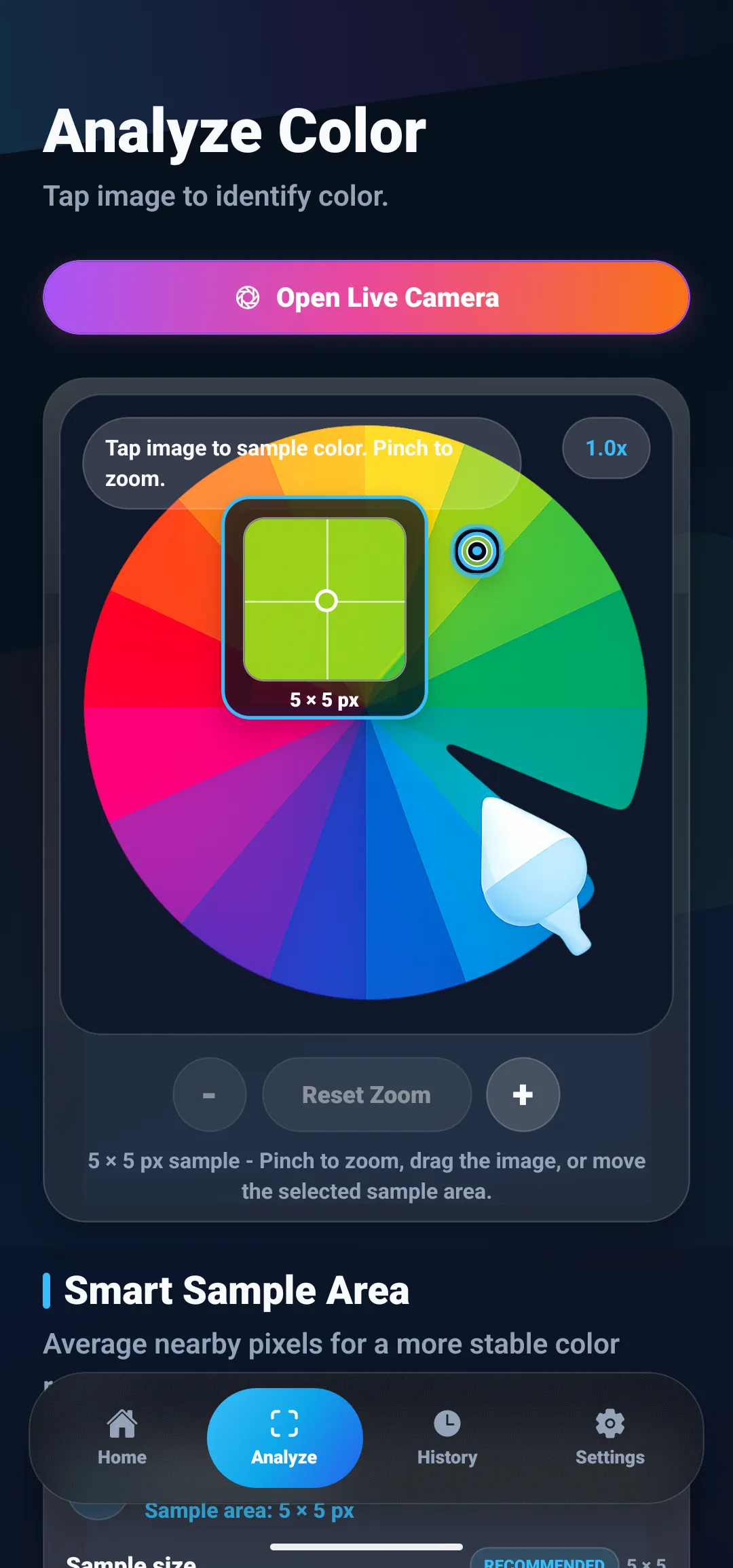
ColorSnap can sample a selected area in a gallery photo and show its digital color values. That is helpful when organizing inspiration or comparing nearby shades, but the result should remain a screen reference. For paint decisions, physical samples viewed in the actual room are the practical check.
If a photo is textured or unevenly lit, a sample area can represent the region more reliably than a single pixel. The article on why color pickers return different HEX values explains how surface texture and lighting affect a reading. For a set of references rather than a single shade, see how to create a palette from an image.
Build a small, usable palette from a trend
A trend shade is easier to use when it has a job. Pick one candidate as the feature color, then look for a light neutral and a deeper supporting color already present in the room’s materials. A useful palette might include a green for cabinetry, a warm off-white for walls, and a brown drawn from the floor or furniture. The exact balance depends on the room; there is no universal formula.
When you save digital references, record where each sample came from and what it represents: “green from cabinet photo,” “warm white from trim,” or “brown from oak floor.” This simple note prevents a sample from becoming detached from its lighting and context. ColorSnap can keep sampled colors in its history or favorites, and its palette tools can help collect related shades from a photo. Its feature overview lists the current photo sampling, palette, and saved-color tools.
Common mistakes when following paint trends
- Treating a forecast as a universal ranking. Brand picks and editorial predictions answer different questions. Compare their shared direction, then decide what suits your space.
- Choosing by name alone. “Sage,” “olive,” and “moss” are descriptive labels, not standardized color values. Compare a physical swatch and its undertone.
- Sampling a tiny highlight in a room photo. Reflections, sun patches, and shadows can be much lighter or darker than the painted surface around them.
- Trusting a phone display as the final color proof. Digital previews help with comparison; real samples show how a paint behaves on your wall.
- Using a strong color timidly across too many unrelated objects. Pick a clear role for the shade, then repeat it intentionally or keep it to one contained feature.
Use forecasts as inspiration, then test the room
The 2027 paint conversation has several directions—organic greens, earthy browns, and expressive accents among them—but the best choice depends on the light and materials in the room. Save images that show the mood you like, sample their colors as references, and test physical paint samples before making a large commitment. A trend can help you discover a direction; the room itself should decide the shade.
Questions
Frequently asked questions
What colors are trending for interiors in 2027?
Published 2027 forecasts point to several directions rather than one universal color: organic greens, warm and earthy browns, dusky pastels, mauve, and richer expressive accents. Paint brands publish their own color picks, so treat these as inspiration and compare them with the light, materials, and finishes in your room.
What is the 2027 Color of the Year?
There is no single industry-wide Color of the Year. For example, Benjamin Moore named Webster Green HC-130, Behr chose Grounded, and Sherwin-Williams selected Celery SW 6421 for 2027. Each is a separate brand announcement, not a shared standard.
How can I tell whether a trending paint color will work in my room?
View a physical sample in the room at different times of day, beside fixed finishes such as flooring and counters. A room photo can help you collect inspiration, but its light, camera processing, and screen can shift the displayed color, so do not use a phone reading as a substitute for a paint sample.
Can I get an exact paint color from a phone photo?
A phone can estimate the digital color stored in a photo, but it cannot recover a paint formula exactly. Lighting, reflections, camera processing, display settings, and the paint finish all affect what the photo shows. Use a photo reading as a visual reference, then compare real paint samples in the room.
How do I use a trend color without repainting an entire room?
Test the color on a removable or easy-to-change element first, such as artwork, a cushion, a small accessory, or a sample board. If you like it beside the room's permanent materials, consider a larger accent such as cabinetry or one wall.
Are paint color forecasts the same as colors people actually choose?
No. A forecast is a design direction selected by a brand or publication, while real purchases vary by region, home, light, and personal taste. Treat forecasts as a source of ideas, not a prediction that every home will use the same shades.
Explore ColorSnap color tools
Start from the ColorSnap homepage or review the complete app features. For focused workflows, learn about the color identifier for Android and iOS, use the photo color picker, or explore the image palette generator. The ColorSnap FAQ answers common questions about formats, images, saved colors, and app usage.