
Warm or Cool? How to Tell a Color's Undertone
Find out whether a white, beige, or gray leans warm, cool, or neutral, using side-by-side checks and the RGB and HSL numbers behind the color.
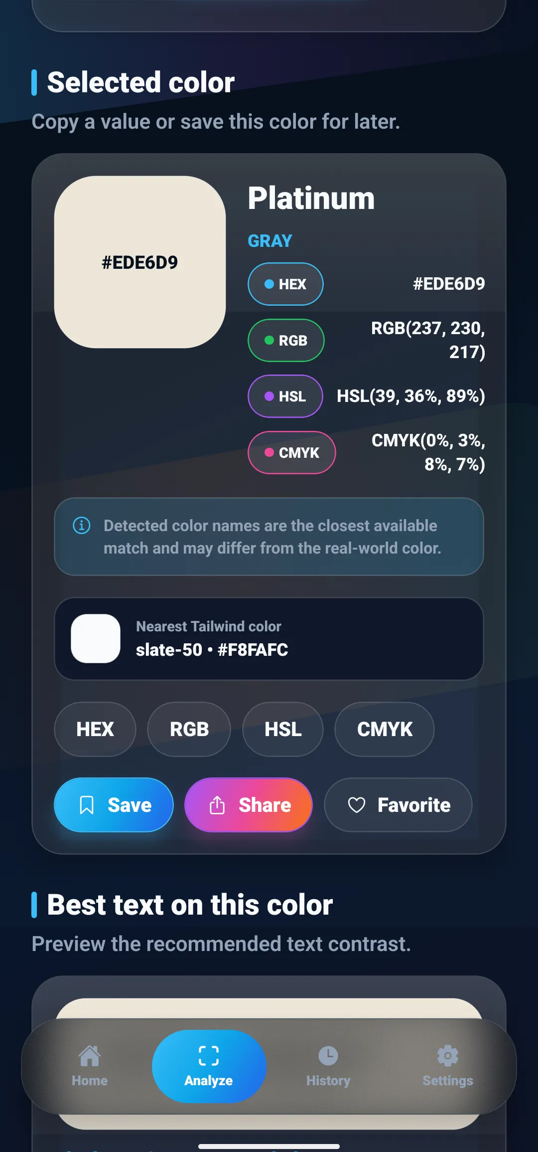
Colors in this guide
Two whites can look identical on a small swatch and completely different once they cover a wall. One turns faintly yellow. The other picks up a gray-blue chill. The same thing happens with a beige sofa that looks pink beside a green rug, or a gray app background that suddenly feels cold next to a warm photo. The difference is the undertone.
The question comes up more often this year. Pantone named a white, Cloud Dancer (PANTONE 11-4201), as its Color of the Year for 2026, which NPR reported is the first time Pantone has chosen a shade of white. Picking between whites, creams, greiges, and grays means telling apart colors that differ by only a few units.
This guide explains what an undertone is, why it is hard to see, and how to find it, including a number-based method that works from any HEX or RGB value. It covers the undertone of a color, such as paint, fabric, or an interface gray, rather than skin undertone. For skin, hair, and eyes, see the guide to doing a seasonal color analysis at home.
The short answer
A color’s undertone is the hue a near-neutral color leans toward: yellow, peach, pink, green, blue, or violet. To find it, compare the color with plain white in daylight, or read its RGB values. The highest channel shows the direction (red for warm, blue for cool, green for green), and the gap between the highest and lowest channel shows how strong the undertone is.
What is a color undertone?
Every neutral has two layers. The first is the color you would name at a glance: white, cream, beige, gray, charcoal. The second is the undertone, a faint hue underneath that only shows up in comparison or across a large area. Two grays that both read as “mid gray” can carry opposite undertones, one leaning blue and the other leaning brown.
Undertones are usually sorted into three groups:
- Warm undertones lean toward yellow, orange, peach, or red. Creams, ivories, tans, and most beiges sit here. Pink undertones are usually grouped with the warm ones as well.
- Cool undertones lean toward blue or violet. Crisp whites, slate grays, and blue-leaning charcoals are typical examples.
- Neutral means no measurable lean. In digital terms, the red, green, and blue values are equal, as in
#808080.
Green is the awkward case. It sits between warm yellow and cool blue on the color wheel, so color advice often treats green undertones as their own group rather than forcing them into warm or cool.
Muted greens such as sage, moss, and olive are easy to mix up for a similar reason. The guide to telling shades of green apart compares them by hue, saturation, and lightness.
Why undertones are hard to see
An undertone is a small signal. In a near-white, the three color channels might differ by 5 or 10 points out of 255. Several things make a difference that small easy to miss or misread.
- Your eyes adapt to the light. Human vision adjusts to the color of the light source, so a white page looks white under a warm lamp and under overcast daylight. The same adjustment hides undertones until a second color gives your eyes something to compare against.
- Neighboring colors push it around. A neutral next to a strong warm color tends to look cooler, and next to a cool color it tends to look warmer. A beige can read pink beside green and yellow beside blue.
- Size changes the read. An undertone that is invisible on a two-inch chip can be obvious across a wall, a sofa, or a full-screen background.
- Cameras and screens add their own shift. A phone photo passes through automatic white balance, and every screen displays color slightly differently, so a neutral can change its lean between the room, the photo, and the display.
Three ways to find a color’s undertone
Use the first two methods with physical samples and the third whenever you have a HEX or RGB value. Combining two of them catches most mistakes.
1. Compare it with pure white
Place the color next to a sheet of plain white paper in indirect daylight, away from colored lamps and strong sun. White is the most useful reference because it has no lean of its own, so whatever difference you see belongs to the sample.
Look along the edge where the two meet:
- yellow, cream, or golden means warm;
- peach or pink means warm, leaning toward red;
- blue-gray or lavender means cool;
- minty or sage means green.
Printer paper is convenient but not perfect. Many papers are brightened to look extra white, which can make them very slightly blue, so a borderline neutral may look a touch warmer against them than it really is.
2. Compare it with other neutrals
Undertones are relative, so they appear fastest in a lineup. Put three to five similar colors side by side, including one you know is warm and one you know is cool. The sample that sits most comfortably next to the warm reference shares its lean.
This works for paint chips, fabric swatches, tile, and interface grays on a screen. It is also the quickest way to check whether two neutrals you plan to use together lean the same way.
3. Read the color’s numbers
Comparison tells you how a color looks in one setting. The numbers give you a lean you can write down, compare, and check again later. Any HEX or RGB value works: one copied from a design file, listed by a manufacturer, or read from a photo with a color picker. If you want a refresher on how the formats relate, the guide comparing HEX, RGB, and HSL covers it. The next section shows how to read them.
How to read an undertone from RGB values
Every HEX code is three numbers in compact form: red, green, and blue, each from 0 to 255. #EDE6D9 is red 237, green 230, blue 217. Reading the undertone from those numbers takes three steps.
Step 1: Find the highest and lowest channel
The order of the three channels tells you which way the color leans.
| Highest → lowest | Direction of the lean | Typical undertone |
|---|---|---|
| Red > Green > Blue | Toward orange and yellow | Warm: cream, ivory, beige, tan |
| Red > Blue > Green | Toward pink and red | Warm: blush, rose, dusty pink |
| Green > Red > Blue | Toward yellow-green | Green: sage, olive-tinged gray |
| Green > Blue > Red | Toward green and teal | Green to cool: mint, sea glass |
| Blue > Green > Red | Toward blue and cyan | Cool: crisp white, slate, steel |
| Blue > Red > Green | Toward violet | Cool: lavender, lilac gray |
| All equal | None | True neutral |
When two channels are almost tied, the color sits near the boundary between two rows. #F2EFE6 (242, 239, 230) has red and green close together with blue well below, which is why it reads as a yellow cream rather than a pink one.
Step 2: Measure the gap
Subtract the lowest channel from the highest. The result, between 0 and 255, is the amount of color in the neutral, which color math calls chroma, and it tells you how strong the undertone is.
- A gap of 0 is a true neutral.
#FFFFFFand#808080have no undertone at all. - Single-digit gaps are subtle. They usually show only beside pure white or beside a neutral with the opposite lean.
- Double-digit gaps on a light color are usually visible once the color covers a large area.
#EDE6D9, with a gap of 20, is a clearly warm off-white.
Step 3: Use the HSL hue for the exact direction
HSL turns the same three channels into a hue angle on a 360° color wheel, using the conversion defined in the CSS Color specification. The hue names the lean more precisely than the channel order does:
- around 0°–20° and 330°–360°: red and pink;
- around 20°–50°: orange, peach, and tan;
- around 50°–70°: yellow and gold;
- around 70°–150°: yellow-green to green;
- around 150°–200°: teal and cyan;
- around 200°–250°: blue;
- around 250°–330°: violet to magenta.
These bands are approximate, since the boundaries between named hues are a matter of convention. #EDE6D9 has a hue of 39°, between orange and yellow, which agrees with its channel order: a warm, slightly golden beige.
Why HSL saturation misleads for light neutrals
It is tempting to read HSL saturation as the strength of the undertone. For very light and very dark colors, that number is inflated.
HSL saturation measures color relative to the maximum possible at that lightness, and close to white or black very little color is possible. A small tint therefore produces a large percentage.
| Color | RGB gap | HSL saturation |
|---|---|---|
#EDE6D9 warm off-white |
20 | 36% |
#F8FAFC faintly cool white |
4 | 40% |
#A39E93 mid greige |
16 | 8% |
The faintly cool white has the smallest gap of the three and the highest saturation. For neutrals, use the RGB gap to judge strength and the HSL hue to judge direction.
Undertones of common neutrals, in numbers
The values below are examples chosen to show each pattern, not specific paint or brand colors.
| Example | RGB | Order, gap, hue | Undertone |
|---|---|---|---|
#FFFFFF |
255, 255, 255 | All equal, gap 0 | None: pure white |
#F2EFE6 |
242, 239, 230 | R > G > B, gap 12, 45° | Warm: cream |
#F2E8EA |
242, 232, 234 | R > B > G, gap 10, 348° | Warm: blush pink |
#E8EDE4 |
232, 237, 228 | G > R > B, gap 9, 93° | Green: sage-tinted |
#E9EEF3 |
233, 238, 243 | B > G > R, gap 10, 210° | Cool: blue |
#A39E93 |
163, 158, 147 | R > G > B, gap 16, 41° | Warm: greige |
#8F959C |
143, 149, 156 | B > G > R, gap 13, 212° | Cool: blue-gray |
#808080 |
128, 128, 128 | All equal, gap 0 | None: true gray |
The two mid grays, #A39E93 and #8F959C, have almost the same lightness. Side by side, the first reads as greige and the second as a cool steel gray, and the channel order predicts that before you ever see them together.
Worked example: the name says gray, the numbers say warm
The screenshot at the top of this guide shows ColorSnap’s result for #EDE6D9, typed in through the app’s Manual HEX input. The app names the color Platinum and files it in the Gray family. The values tell a different story. RGB 237, 230, 217 puts red highest and blue lowest, the gap is 20, and the HSL hue is 39°. That is a warm, cream-leaning off-white, not a neutral gray.
The name is approximate rather than wrong. Color names come from the nearest entry in a fixed list, and the closest entry here is Platinum, #E5E4E2, which is almost perfectly neutral with a gap of 3. A nearest-name match reports which entry is closest overall, so the undertone can get lost on the way. The same applies to the Nearest Tailwind color line on that card: ColorSnap compares against a short list of representative Tailwind CSS colors, and the only near-white in that list, slate-50 (#F8FAFC), leans faintly blue.
ColorSnap says as much on the result card: detected color names are the closest available match and may differ from the real-world color. For everyday labels, a name is fine. For undertone decisions, read the channels. The guide to color names versus color codes explains why a name and a code answer different questions.
How to check an undertone with your phone camera
A physical object, such as a wall, a fabric swatch, a sofa, or a floor tile, has to be photographed or scanned before you have numbers to read. That adds the camera’s own color decisions, so aim for a reading you can trust relative to a reference rather than an absolute value.
- Use even, neutral light. Indirect daylight works best. Turn off warm bulbs and colored lights, and avoid glare and direct sun.
- Put a white reference in the frame. A sheet of plain white paper beside the object lets you check the photo itself.
- Read the reference first. If the paper reads with red highest, the whole image has a warm cast, and an object that reads only slightly warm may actually be neutral.
- Average an area, not a pixel. Painted surfaces, fabric, and wood vary from pixel to pixel, so sample a patch with an averaging method.
- Take several readings. Sample three or more spots and compare the lean, not just the HEX code.
Step 3 prevents the most mistakes. If the paper reads R > G > B with a gap of 8 and the sofa reads R > G > B with a gap of 10, the sofa is only a little warmer than the paper, so most of that warmth is coming from the light or the camera. If the paper reads close to neutral and the sofa shows a gap of 18 toward red, the warmth belongs to the sofa. The camera color identifier guide explains white balance and lighting in more depth.
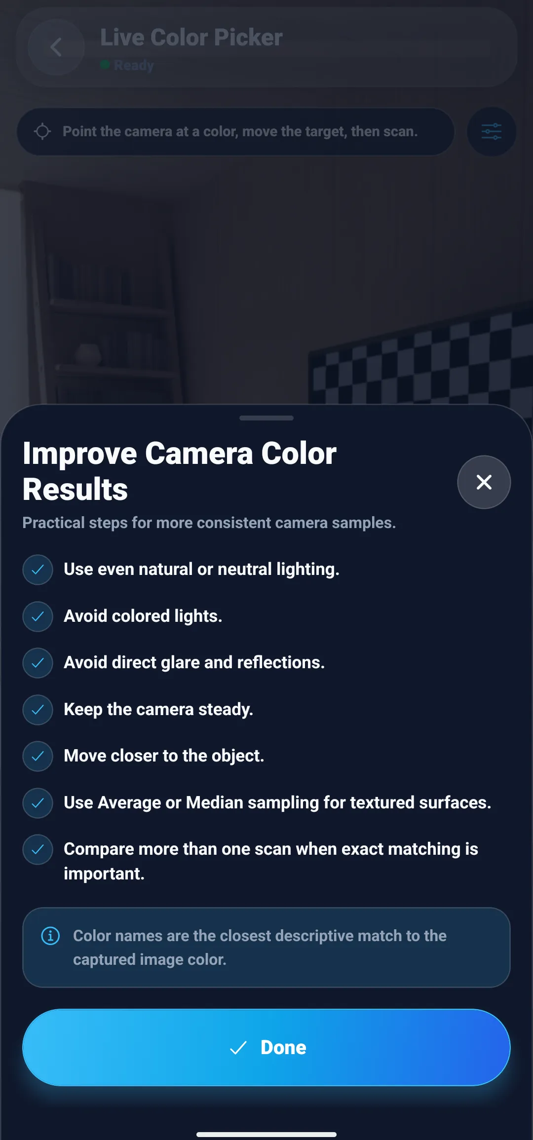
ColorSnap’s Live Color Picker builds most of these habits into the camera screen. Its help sheet lists them directly: even natural or neutral lighting, no colored lights, no glare or reflections, a steady camera, a closer view, Average or Median sampling for textured surfaces, and more than one scan when an exact match matters.
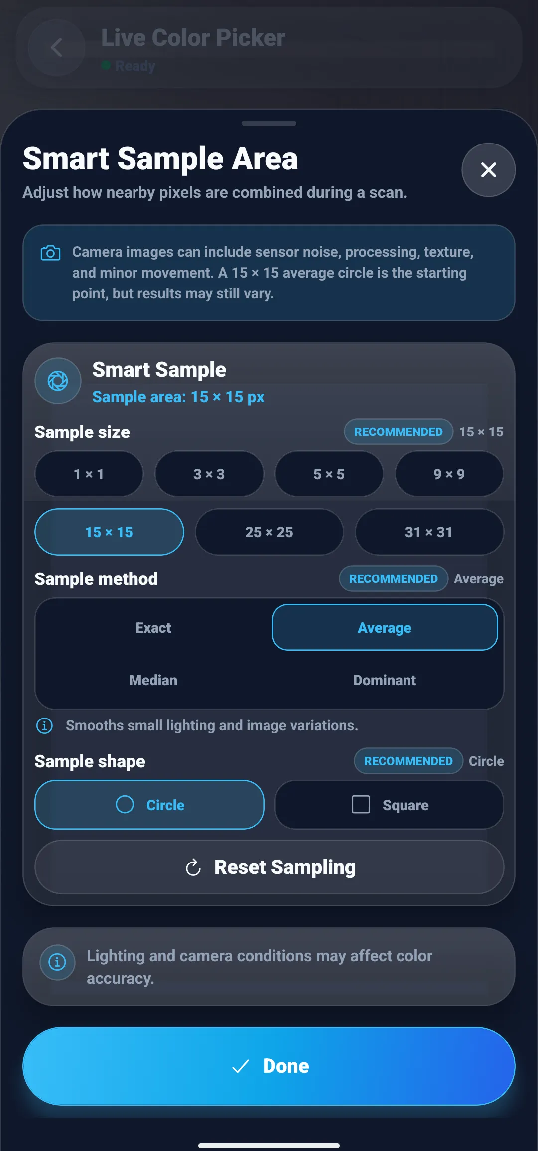
The sampling controls sit behind the slider icon on the same screen. The Smart Sample Area sheet sets the sample size from 1 × 1 up to 31 × 31 pixels, the method (Exact, Average, Median, or Dominant), and the shape (Circle or Square). For the camera, it recommends a 15 × 15 Average circle as the starting point, which suits flat painted surfaces. Switch to Median for textured fabric or wood grain, where a few bright or dark pixels would pull an average off course. The guide on why a color picker gives different HEX codes explains each method in detail.
Saved readings keep their sample size and method in the history, so you can compare the lean of several samples later and know they were read the same way. When a manufacturer lists a HEX value for a color you are considering, typing it into Manual HEX input shows its RGB, HSL, and CMYK values, so you can compare its channel order and gap with your own reading.
Common undertone mistakes
- Judging under a warm bulb. Evening light from warm bulbs pushes every neutral toward yellow. Check in daylight, then again in the light the space will actually use.
- Trusting the name. Names such as Platinum, Linen, or Cloud describe a family, not a lean. Read the channels.
- Reading HSL saturation as strength. Near white and near black, saturation percentages run high. Use the RGB gap.
- Judging one swatch on its own. Without a reference, your eyes adapt and the undertone fades. Always compare.
- Pairing opposite leans by accident. A pink-leaning beige next to a green-leaning gray pushes both further apart. Matching leans or a deliberate contrast both work, while an accidental mix usually looks slightly off.
- Treating a photo’s numbers as absolute. Without a white reference in the frame, you cannot separate the object’s undertone from the camera’s white balance.
Using undertones in a digital palette
Interface neutrals have undertones too. Backgrounds, borders, and text grays that share one lean make a palette feel coherent, while a set that mixes blue-leaning and brown-leaning grays tends to look unplanned. A common approach is to tint the neutrals with the brand hue at very low saturation, which the guide to building a palette from one color walks through. You can check the result with the method above: a consistent set of neutrals keeps the same channel order from the lightest shade to the darkest.
Read the lean, then check it in the real light
An undertone is a direction, and once you know where to look it is easy to name. Compare the color against white, line it up with other neutrals, and read the RGB channels: the highest channel gives the lean, the gap gives the strength, and the HSL hue gives the exact direction. Then confirm your choice in the light where the color will live, because that is where its undertone will be seen.
To take readings from real objects on Android, ColorSnap’s color identifier shows HEX, RGB, HSL, and CMYK values side by side, and the color code guides cover each format in more depth.
Questions
Frequently asked questions
What is a color's undertone?
A color's undertone is the subtle hue that a near-neutral color leans toward underneath its obvious color. A white can lean yellow, pink, green, blue, or violet, and a gray or beige can do the same. Undertones are easiest to see when the color is placed next to pure white or next to a neutral with a different lean.
How do you tell if a white is warm or cool?
Hold it next to plain white paper in indirect daylight, or read its RGB values. If red is the highest channel and blue the lowest, the white leans warm, toward cream or yellow. If blue is the highest channel, it leans cool. If all three values are equal, it is a pure white with no undertone.
Can you find a color's undertone from its HEX code?
Yes. Convert the HEX code to RGB and compare the three channels. The highest channel shows the direction of the lean, and the gap between the highest and lowest channel shows its strength. #F2EFE6, for example, is RGB 242, 239, 230: red is highest, blue is lowest, and the 12-point gap makes it a cream-leaning white.
Is greige warm or cool?
Most greiges lean warm, because the beige in them usually comes from yellow or red. Some lean green or slightly violet instead. In RGB terms, a warm greige has red highest and blue lowest, as in #A39E93 (163, 158, 147), while a greige with green as its highest channel leans toward sage.
Why does HSL show high saturation for a color that looks almost white?
HSL saturation measures color relative to the most that is possible at that lightness, and very little color is possible close to white. A tiny tint therefore produces a large percentage. #EDE6D9 reports 36% saturation even though its channels differ by only 20 points. For light and dark neutrals, the RGB gap is a better guide to undertone strength.
Why does my phone photo show a different undertone than I see in person?
Phone cameras apply automatic white balance and other processing that can remove a subtle undertone or add one, and the light in the room tints everything the camera records. Photograph the color in indirect daylight with a sheet of white paper in the frame, then compare the object's reading with the paper's reading instead of trusting the numbers alone.
Explore ColorSnap color tools
Start from the ColorSnap homepage or review the complete app features. For focused workflows, learn about the color identifier for Android and iOS, use the photo color picker, or explore the image palette generator. The ColorSnap FAQ answers common questions about formats, images, saved colors, and app usage.