
How to Choose Accessible Colors for Charts and Graphs
Choose chart colors by data type, make series easier to distinguish, and check text and graphic contrast without relying on color alone.
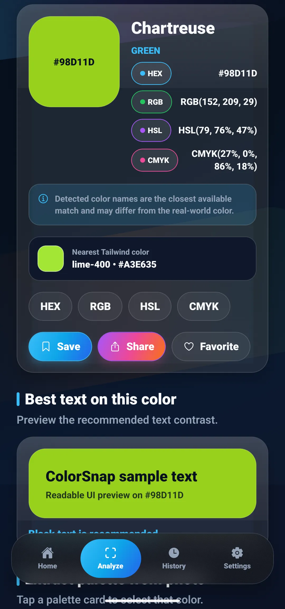
Colors in this guide
Two lines on a chart can use different HEX values and still look nearly identical to a reader. If the only clue is a red line versus a green line, some viewers may not be able to tell which series is which. A chart palette needs to do more than look harmonious: it should match the data, remain legible against its background, and keep meaning available when colors are hard to distinguish.
The right approach depends on what the chart is showing. Categories, ordered values, and values around a midpoint need different color structures. This guide explains how to choose among them, add non-color cues, and check contrast without treating one color tool as a complete accessibility audit.
The short answer
Choose chart colors based on the data: use distinct hues for unordered categories, a light-to-dark progression for ordered values, and two directions around a meaningful midpoint for diverging values. Then pair color with labels, shapes, patterns, or line styles so the chart does not rely on hue alone. Check text and meaningful graphic marks against their backgrounds separately.
Start with the kind of data
Before choosing swatches, decide what relationship the chart needs to communicate. ColorBrewer’s guidance distinguishes three common palette types: qualitative, sequential, and diverging. The ColorBrewer scheme guide explains how each maps to a different kind of data.
Use qualitative colors for unordered categories
Qualitative data consists of named groups without a natural ranking: product types, departments, or regions. Give categories distinct hues, but avoid implying that one category is “more” or “less” than another through a light-to-dark sequence.
If a chart has many categories, do not keep adding colors until every item gets its own swatch. A dense legend is hard to scan and colors begin to compete. Consider grouping related categories, using small multiples, or labeling marks directly. If the chart uses lines, vary line style or markers as well as color.
Use sequential colors for ordered values
A sequential scale represents numbers that move from low to high, such as counts, temperatures, or time spent. A progression in lightness makes the order visible: lighter shades can represent lower values and darker shades higher ones, or the reverse if the legend makes that direction clear.
Keep the ramp steady. If a scale jumps from pale blue to saturated orange halfway through, viewers may interpret the hue shift as a second category or an unmarked threshold. Use a smooth, ordered ramp unless a meaningful boundary in the data calls for a change.
Use diverging colors around a meaningful center
A diverging scale suits values on both sides of a meaningful midpoint, such as below and above zero, or below and above a target. One hue direction represents values on one side, a different direction represents the other, and a neutral center marks the midpoint.
Do not use a diverging palette just because two colors look balanced together. If the data has no important center, a sequential ramp is usually clearer. Label the midpoint in the legend so the two directions have an explicit meaning.
Make the chart readable without color alone
The W3C guidance for WCAG Success Criterion 1.4.1 says color must not be the only visual way to convey information, indicate an action, prompt a response, or distinguish an element. For charts, that means a viewer should not have to decode a color legend as the sole route to the data.
Add a second cue that fits the chart:
- Direct labels identify a line or bar near the data instead of making readers travel back and forth to a legend.
- Line styles such as solid, dashed, and dotted help distinguish line-series in print and on screen.
- Marker shapes such as circles, squares, or triangles add a visible distinction to points.
- Patterns or textures can distinguish filled regions when the graphic supports them and the patterns remain clear at the size people will view.
- A table or text summary gives readers another way to access the underlying values and the chart’s main takeaway.
Use only the cues that make the chart easier to understand. A chart does not become accessible simply by adding every possible marker and texture; clutter can obscure the data too.
Check contrast for text and important marks
Text contrast and chart-mark contrast are related but separate checks. Axis labels, legends, annotations, and data labels are text, so check each text color against its actual background. The W3C understanding document for text contrast explains the text criterion.
Meaningful graphic parts have a separate consideration. WCAG 2.2 Success Criterion 1.4.11 covers graphical objects needed to understand content and specifies at least 3:1 contrast against adjacent colors within its scope. Whether a particular chart mark is meaningful, and how the criterion applies, depends on the chart and its presentation; read the W3C guidance rather than applying the number mechanically to every pixel.
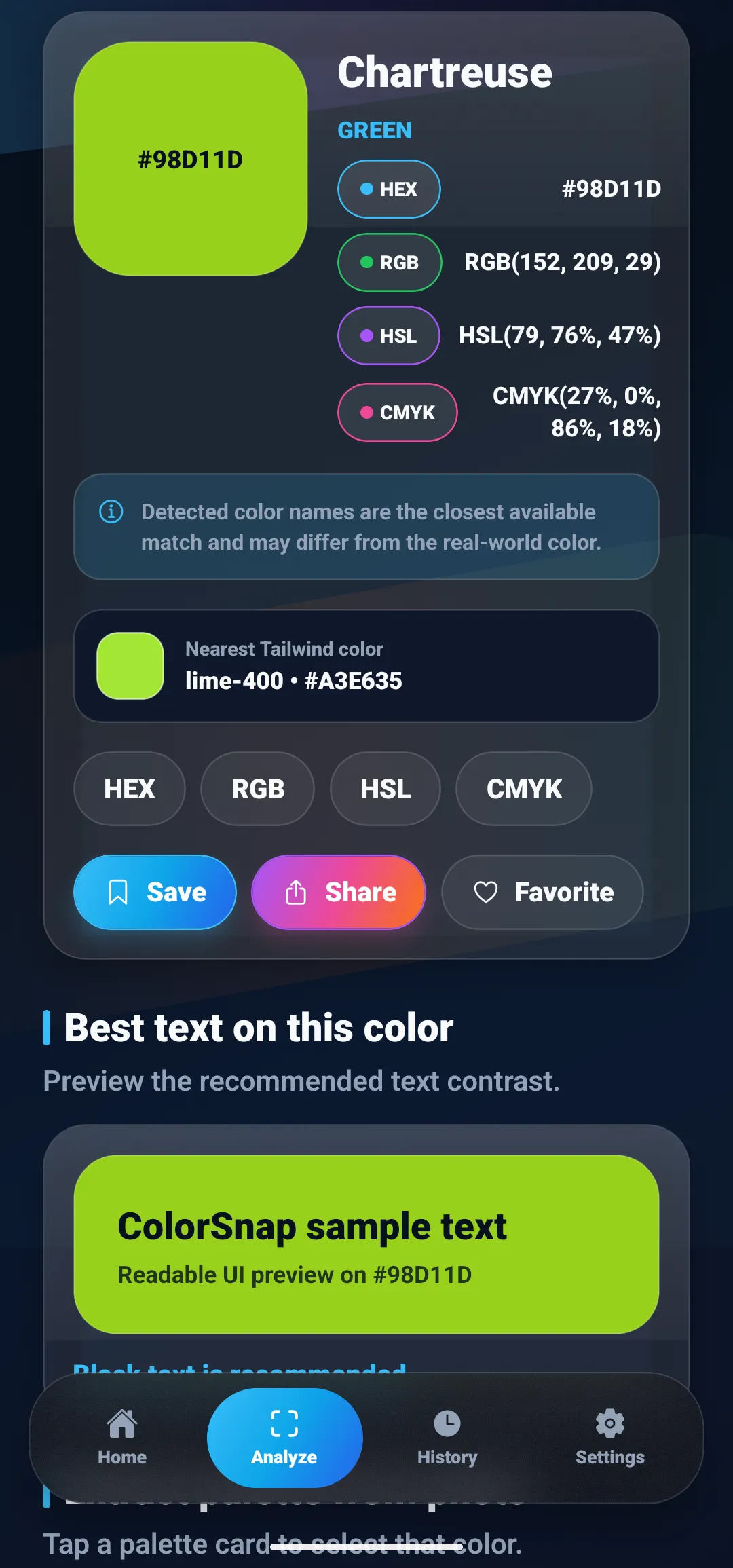
ColorSnap’s contrast checker compares a foreground and background color pair, which can help when checking chart labels against a plot background. It does not determine whether a red and green series are distinguishable, whether all meaningful marks meet every applicable criterion, or whether a non-color cue is present. Use it for that pairwise contrast question, then review the chart itself. See the color contrast checker guide for background and text contrast basics.
A practical chart-color workflow
- Write down the data relationship. Is the chart comparing categories, showing an ordered range, or highlighting values above and below a meaningful center?
- Choose the matching palette structure. Start with qualitative, sequential, or diverging colors accordingly. ColorBrewer offers examples organized by scheme type and number of classes.
- Keep the number of hues purposeful. Use only as many category colors as readers need to compare at once. Combine or split categories if the legend is becoming the main task.
- Add a non-color cue. Use a direct label, line style, marker, pattern, or adjacent table so meaning survives when hue perception differs or the chart is printed in grayscale.
- Check the actual foregrounds and backgrounds. Test axis and data labels against their rendered surfaces, and inspect meaningful graphic boundaries against neighboring colors.
- Review the chart at its real size. A line that looks distinct when enlarged may disappear in a slide thumbnail or mobile view. Check a print copy too if print is part of the use case.
- Test a grayscale or color-vision simulation as an extra check. These previews can reveal potential collisions, but they cannot represent every viewer’s experience or replace labels and alternate ways to read the data.
For related guidance, the article on identifying colors when you have color-vision differences explains color naming and visual comparison, while the guide to building a palette from one color covers hue relationships and lightness variants. The palette still needs to follow the data structure: a visually pleasing set is not automatically a good quantitative scale.
Common mistakes to avoid
- Using rainbow hues for an ordered scale. Without a deliberate, perceptually clear order, the shifts between hues can suggest boundaries that are not in the data.
- Using red and green as the only opposing signals. Add labels, symbols, or line styles, and select colors that remain distinct in the context where the chart appears. The Color Universal Design guide offers examples and resources for figures designed with color-vision differences in mind.
- Making a legend do all the work. Direct labels and a short text summary reduce the effort of matching each mark to a distant key.
- Checking only the background. Adjacent series can blend into each other even when each series contrasts clearly with the plot area.
- Treating one contrast ratio as the entire accessibility test. Contrast does not confirm that categories are distinguishable, that the graph has text alternatives, or that color is not the only cue.
- Assuming a palette is accessible because it has a label. Test the colors in your actual chart, at its intended size, with its labels and backgrounds.
A useful palette starts with a clear encoding
Accessible chart color begins with a simple decision: what does color mean in this graphic? Match the palette type to that relationship, add a second cue for important distinctions, and check text and graphic contrast in context. A color picker or contrast checker can help inspect individual values and pairs, but clear labels and an understandable chart structure do the rest.
Questions
Frequently asked questions
How do I choose accessible colors for a chart?
First match the palette to the data: use distinct hues for categories, an ordered lightness ramp for low-to-high values, and two contrasting directions around a meaningful midpoint for diverging values. Then add labels, shapes, patterns, or line styles so color is not the only way to read the chart, and check text and important marks against their backgrounds.
What is the difference between a sequential and diverging color palette?
A sequential palette represents values ordered from low to high, usually with a progression in lightness. A diverging palette represents values on either side of an important midpoint, such as zero or a target, using two color directions that meet around a neutral center.
Should chart categories use different colors?
Different hues can distinguish a small set of unordered categories, but a viewer should not have to identify every series by color alone. Pair color with direct labels, different line styles, markers, or patterns, and consider separating the chart when many categories compete.
Does a color contrast checker make a chart accessible?
No. A contrast checker can help evaluate a text and background pair, but it does not tell you whether two data series are distinguishable or whether the chart has a non-color cue, labels, or a text alternative. Those need separate checks.
What contrast does WCAG require for meaningful chart graphics?
WCAG 2.2 Success Criterion 1.4.11 says meaningful graphical objects and user-interface indicators need at least 3:1 contrast against adjacent colors, subject to the criterion's scope and exceptions. This is separate from text contrast and from the requirement not to use color as the only visual way to convey information.
How can I make a chart usable in grayscale?
Add another distinction before relying on hue: direct labels, different marker shapes, solid and dashed lines, patterns, or a data table can carry the same information. A grayscale preview can expose colors that collapse to similar lightness, but it is only one check and does not replace testing the chart with its labels and alternatives.
Explore ColorSnap color tools
Start from the ColorSnap homepage or review the complete app features. For focused workflows, learn about the color identifier for Android and iOS, use the photo color picker, or explore the image palette generator. The ColorSnap FAQ answers common questions about formats, images, saved colors, and app usage.