
How to Do a Seasonal Color Analysis at Home
Find your color season at home with daylight tests for undertone, depth, and clarity, then learn how to read any clothing color by hue, value, and chroma.
Colors in this guide
Seasonal color analysis started as a 1980s makeover trend and has had a big revival on TikTok and Instagram. The promise is simple: find the colors that make your skin look clearer and your eyes brighter, and stop buying clothes that wash you out. The problem is that most at-home attempts go wrong in the same few ways. People judge under a warm bulb, trust a filter, or decide everything from the color of their wrist veins.
This guide explains how a color analysis works, walks through a home method that controls the usual mistakes, and shows how to describe any clothing color with the same three dimensions that seasons are built on: hue, value, and chroma. Those three dimensions map onto numbers you can read from a color code, which turns “does this suit me?” into a check you can repeat in a store or a fitting room.
The short answer
To do a seasonal color analysis at home, sit facing a window in indirect daylight with no makeup and your hair and clothes covered in white or gray. Then compare pairs of fabrics under your chin to judge three traits: warm or cool (hue), light or deep (value), and bright or muted (chroma). Your strongest trait points to your season, and your weakest trait matters least.
What is seasonal color analysis?
Seasonal color analysis is a style system that groups people by the natural coloring of their skin, hair, and eyes, then recommends clothing and makeup colors that harmonize with it. The four-season version was popularized by Carole Jackson’s 1980 book Color Me Beautiful, and later systems expanded it to 12 or 16 seasons.
It is a convention, not a measurement standard. Different schools draw the boundaries differently, and many people look good in colors outside their assigned palette. Used well, it is a shortcut for narrowing choices, not a rule about what you are allowed to wear.
The three dimensions every season is built on
Modern seasonal systems describe a person, and every color, along three dimensions borrowed from the Munsell color system, a color-ordering system developed by painter Albert Munsell:
- Hue (temperature): whether a color leans warm, toward yellow, or cool, toward blue. A coral red is warm. A raspberry red is cool.
- Value (depth): how light or dark a color is. Pale peach is light. Chocolate brown is deep.
- Chroma (clarity): how pure or grayed a color is. A clear fuchsia is high chroma. A dusty rose is low chroma, often called soft or muted.
The same three ideas appear in HSL, the color format most color pickers show beside HEX and RGB: hue is the H angle, lightness is the L, and saturation is a rough stand-in for chroma. If HSL is new to you, the comparison of HEX, RGB, and HSL explains how the formats relate.
How the 4 seasons and 12 seasons map to those dimensions
The four classic seasons combine temperature with an overall impression of depth and clarity:
| Season | Temperature | Typical depth | Typical clarity |
|---|---|---|---|
| Spring | Warm | Light to medium | Clear, bright |
| Summer | Cool | Light to medium | Soft, muted |
| Autumn | Warm | Medium to deep | Soft to rich |
| Winter | Cool | Deep, high contrast | Clear, bright |
The 12-season system names each sub-season after its dominant trait. A common scheme is Light, True, and Bright Spring; Light, True, and Soft Summer; Soft, True, and Deep Autumn; and Bright, True, and Deep Winter. “True” means temperature is the strongest trait. “Light” and “Deep” mean value dominates, while “Bright” and “Soft” mean chroma dominates. Exact names and boundaries vary between practitioners.
How to do a color analysis at home, step by step
The goal is to see how colors change your face, not to judge the colors themselves. Lighting matters more than any other variable, so set up first.
1. Set up neutral light and a neutral frame
- Use indirect daylight. Sit facing a window around midday, out of direct sun. Turn off warm lamps and colored LED strips.
- Remove makeup, tinted moisturizer, and self-tan. All three add color you would be judging instead of your skin.
- Cover strong colors. Wrap hair dyed in a strong shade in a white or light gray towel, and wear a white or gray top. A bright shirt reflects color onto your jaw.
- Use a mirror and a phone. Judge live in the mirror, and take photos as a record. Keep the phone’s camera settings the same for every shot, and avoid beauty filters or portrait modes that smooth or tint skin.
2. Judge value and contrast first
Value is the easiest dimension to see and the hardest for lighting to fake. Take a photo of your face and convert it to black and white with your phone’s photo editor. Then compare your hair, skin, and eyes:
- Low contrast: hair, skin, and eyes sit close together in gray. This often points toward Light or Soft seasons.
- High contrast: dark hair against light skin, or very light eyes against deep skin. This often points toward Winter or the Bright seasons.
- Overall depth: if everything in the grayscale photo reads light, Light seasons are likely. If everything reads deep, look at Deep Autumn and Deep Winter.
Because both areas are in the same photo, their difference in lightness holds up better than their exact values, even when the camera exposes the whole frame a little brighter or darker.
3. Test clarity with a bright and a muted pair
Hold two fabrics of the same general color under your chin, one clear and one dusty. A vivid fuchsia against a dusty rose works, as does a bright cobalt against a grayed slate blue.
Watch your skin, not the fabric. The right chroma makes skin look smoother and more even. The wrong one either overwhelms you, so you notice the color before your face, or drains you, so you look tired and gray. If bright colors win, look at Spring and Winter. If muted colors win, look at Summer and Autumn.
4. Test temperature last
Temperature is the trait most people start with and the one lighting distorts most, which is why it comes last. Compare warm and cool versions of the same thing:
- pure white against cream or ivory;
- silver against gold;
- a blue-red against an orange-red.
Warm-leaning people usually look healthier in cream, gold, and orange-reds, while white and silver make them look sallow or gray. Cool-leaning people tend to look the reverse. If neither side clearly wins, you may be neutral, and depth or clarity will decide your season instead.
The popular vein test, checking whether wrist veins look blue or green, is a weak substitute. How veins appear through the skin depends on skin thickness, tanning, redness, and the light in the room, and it is particularly hard to read on olive and deeper skin tones.
5. Name the dominant trait
Rank your three results by how strongly each one showed. The trait that made the most visible difference is your dominant trait, and it names your season family in the 12-season system. Someone who is clearly low contrast, mildly cool, and strongly muted is likely a Soft Summer. Someone who is strongly warm, medium in depth, and moderately rich is likely a True Autumn.
If two seasons feel equally right, they usually share a dominant trait. Soft Summer and Soft Autumn are both muted, and Bright Spring and Bright Winter are both clear. Test colors from both palettes rather than forcing a decision.
What a phone photo can and cannot tell you
A phone camera does not record your skin as it is. It records your skin under the light in the room, then applies automatic white balance, exposure, sharpening, and sometimes face smoothing. Each of those steps can shift exactly the warm-versus-cool signal a color analysis depends on.
That is why AI color analysis apps and filters disagree with each other and with themselves. Kettlewell Colours, a UK color-draping business, tested several popular AI apps on a subject whose season was already known, using studio lighting designed to mimic daylight. It reported inconsistent results, and noted that the tools that worked best let users compare colors against their own face instead of announcing a verdict. As a draping business, it has a stake in the answer, but its point about lighting matches what any camera does.
Reading your skin with a color picker has the same limits. Skin of almost every depth usually reads as an orange-family hue with red the highest channel, and the difference between a warm and a cool undertone is often smaller than the shift a warm room light adds. The undertone guide explains how to check a photo against a white reference, but for your own face, side-by-side fabric comparisons in daylight are more reliable than any single number.
Where a phone is genuinely useful is the second half of the job: deciding whether a specific piece of clothing fits the palette you found.
How to read any clothing color by hue, value, and chroma
Once you know your season, every garment becomes a three-question check. You can answer it by eye, or with a color code from a photo, a product listing, or a color identifier.
Hue: does it lean toward yellow or blue?
Temperature is relative to the color family, so compare the hue angle with the family’s center rather than labeling a whole family warm or cool:
- Reds and pinks: hues from about 0° to 20° lean toward orange and read warm. Hues from about 320° to 355° lean toward magenta and read cool.
- Greens: around 75° to 110°, toward yellow-green, reads warm. Around 140° to 170°, toward blue-green, reads cool.
- Blues: around 180° to 200°, toward teal, is the warmest blue. Around 225° to 250°, toward violet, is the coolest.
These bands are rules of thumb, not a standard, and the boundaries between named hues are a matter of convention.
Value: is it light or deep?
HSL lightness gives a quick first read: above about 70% is light, below about 35% is deep. It is approximate, because HSL lightness is not perceptual. At the same L value, a yellow looks much lighter than a blue, so compare garments within one color family when depth matters.
Chroma: is it clear or muted?
HSL saturation is misleading for dark and very light colors. CSS navy, #000080, reports 100% saturation simply because it is a pure blue at low lightness. A steadier guide is the gap between the highest and lowest RGB channels, the same measure the undertone guide uses: the bigger the gap, the more color the garment carries. As a rough guide for comparing clothes, a gap under about 70 reads soft, and a gap over about 140 reads clear.
| Example color | HEX | HSL | RGB gap | How it reads |
|---|---|---|---|---|
| Coral | #FF7F50 |
16°, 100%, 66% | 175 | Warm, medium-light, clear |
| Medium violet red | #C71585 |
322°, 81%, 43% | 178 | Cool, medium, clear |
| Light steel blue | #B0C4DE |
214°, 41%, 78% | 46 | Cool, light, soft |
| Dusty rose | #C08081 |
359°, 34%, 63% | 64 | Near-neutral red, medium, soft |
| Sage | #9CAF88 |
89°, 20%, 61% | 39 | Warm-leaning green, medium, soft |
| Sienna | #A0522D |
19°, 56%, 40% | 115 | Warm, deep, moderately rich |
| Navy | #000080 |
240°, 100%, 25% | 128 | Cool, deep, fairly clear |
Read across a row and the season fit follows. Coral’s warm, clear profile is typical of Spring palettes. Light steel blue is a classic Summer color. Sienna sits in Autumn territory, and navy appears in many Winter palettes. Sage and dusty rose are soft enough to appear in both Soft Summer and Soft Autumn palettes, depending on the exact shade. The guide to shades of green shows how much sage values vary.
Checking clothes with a color identifier
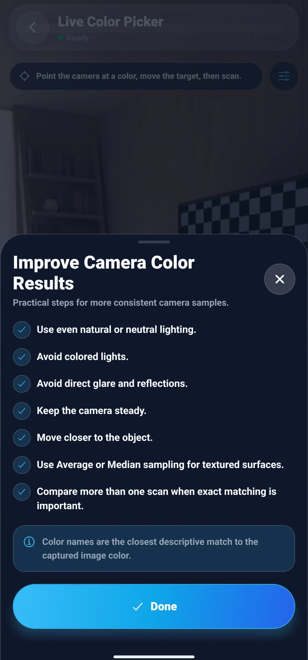
Sampling a garment is easier than sampling skin, because fabric does not change with your mood or blood flow and you can photograph it beside a white reference. It still helps to sample carefully. A knit, tweed, or denim surface contains many small light and dark fibers, so a single pixel can land on a highlight or a shadow.
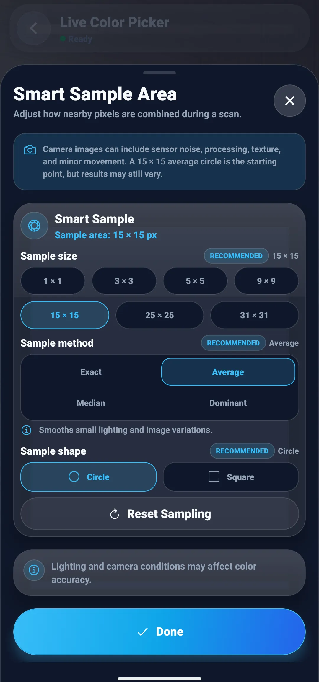
In ColorSnap’s Live Color Picker, the slider icon opens the Smart Sample Area sheet. It sets the sample size from 1 × 1 up to 31 × 31 pixels, the method (Exact, Average, Median, or Dominant), and the shape. For textured fabric, a larger area with Median sampling keeps stray fibers from pulling the reading off course. The guide on why a color picker gives different HEX codes explains each method.
The result card then shows the three numbers this guide uses. In the example below, a sample reads #98D11D, which ColorSnap names Chartreuse. HSL 79°, 76%, 47% puts it at a yellow-leaning green hue, medium lightness, and high saturation, and RGB 152, 209, 29 gives a channel gap of 180. That profile is warm and clear: a color that belongs with Spring brights and would likely overpower a Soft Summer.
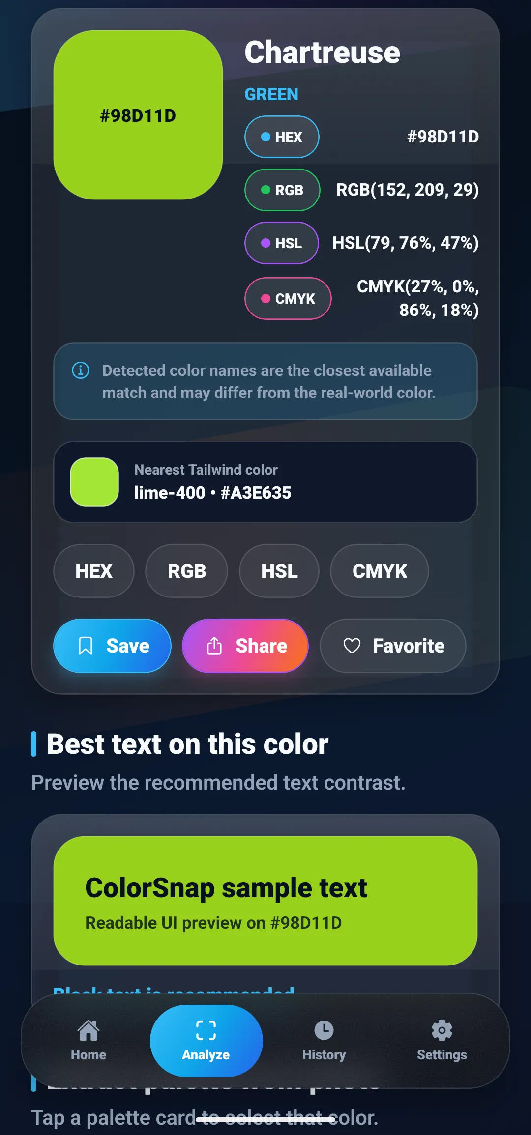
Two cautions apply. First, color names are labels, not classifications: ColorSnap’s result card notes that detected names are the closest available match and may differ from the real-world color. Second, a photo of fabric under store lighting carries that light’s tint. Where possible, read the garment near a window, or compare it with something white in the same frame.
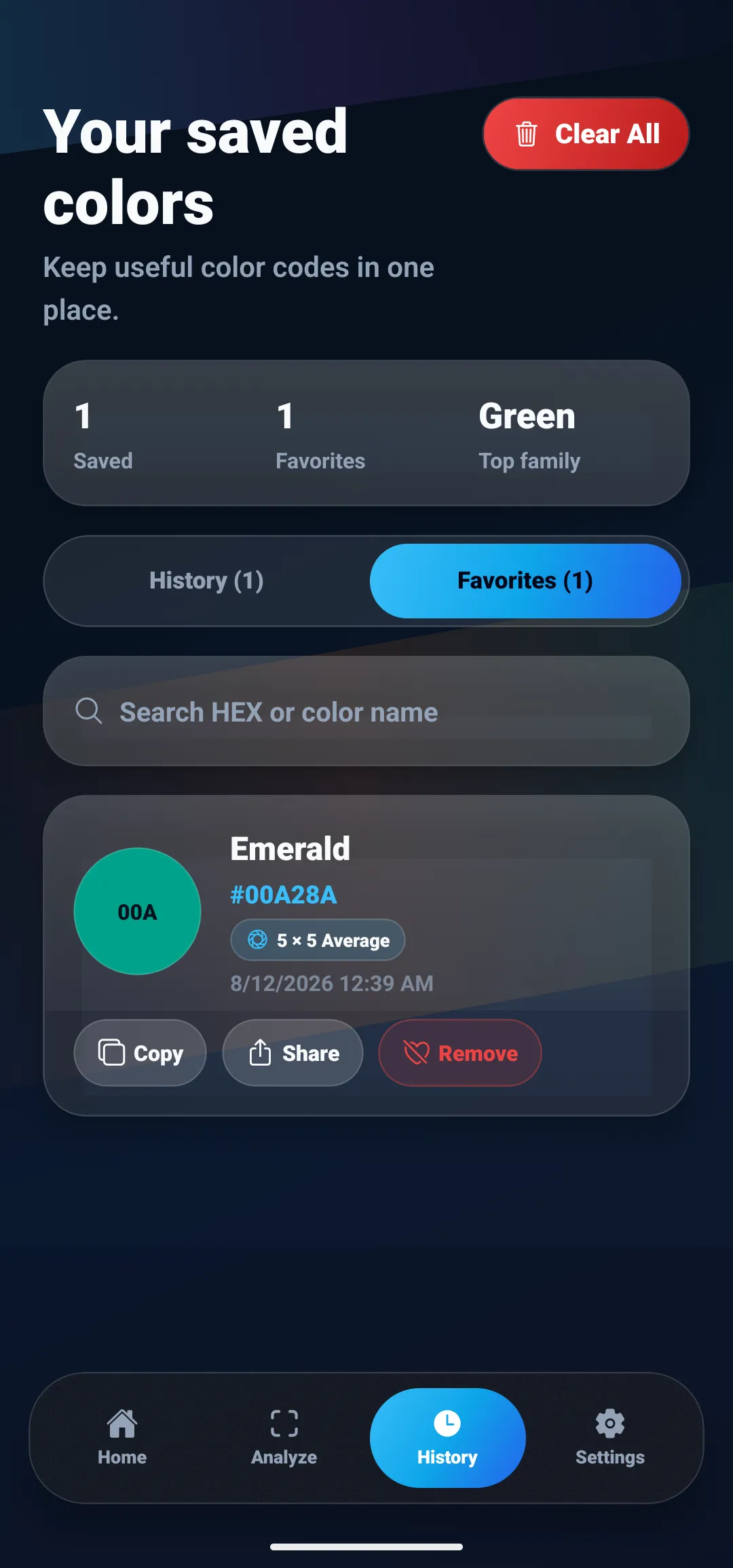
If you find colors that work, save them. ColorSnap keeps favorites in a searchable list, and each saved reading records its sample size and method, such as 5 × 5 Average, so you can tell later whether two colors were measured the same way. A small palette of tested colors is more useful while shopping than a generic season chart, because it reflects your own wardrobe and lighting.
Common at-home color analysis mistakes
- Judging under warm indoor light. Warm bulbs push every face toward warm. Use daylight, then check your favorites in the light where you will actually wear them.
- Starting with temperature. Undertone is the hardest trait to see. Judge depth and clarity first, since they are often the stronger signals.
- Trusting a single filter or selfie. Automatic camera processing can change the result from one photo to the next.
- Reading dyed hair as natural coloring. Many systems judge your natural coloring, but the hair you wear now still changes your overall contrast, so test colors with your current look too.
- Treating the palette as a rulebook. A season narrows choices. If a color outside your palette makes you feel good and looks good in daylight, wear it.
- Reading HSL saturation for dark colors. Navy, burgundy, and forest green report very high saturation because they are dark. Use the RGB gap instead.
Start with daylight, then trust the comparison
A good color analysis is a series of side-by-side comparisons in honest light: depth first, then clarity, then temperature, ending with the trait that made the biggest difference. Once you know it, hue, value, and chroma give you a way to check any garment, by eye or by its color code, before it reaches your closet.
To read garment colors from photos or the live camera on Android, iPhone, or iPad, ColorSnap’s color identifier shows HEX, RGB, HSL, and CMYK values side by side, and the camera color identifier guide covers lighting and white balance in more depth.
Questions
Frequently asked questions
Can I do a seasonal color analysis at home?
Yes, if you control the conditions. Sit facing a window in indirect daylight, remove makeup, cover your hair and clothes with white or gray, and compare pairs of fabrics under your chin: warm versus cool, light versus deep, and bright versus muted. Decide which of the three traits is strongest. A home result is a good starting point, and a professional draping can confirm it.
How do I know if my skin undertone is warm or cool?
Compare your face beside pure white and cream fabric, and beside silver and gold, in indirect daylight. If cream and gold make your skin look even and healthy while white and silver look harsh or gray, you probably lean warm; the reverse suggests cool. If both look similar, you may be neutral, and depth or clarity will matter more than temperature.
Is the vein test accurate for finding your undertone?
It is a weak signal. How veins look through the skin depends on skin thickness, tanning, redness, and the light in the room, and the test is especially hard to read on olive and deeper skin. Comparing white and cream fabric, or silver and gold, beside your face in daylight gives a more direct answer.
Are AI color analysis apps and filters accurate?
Treat them as rough suggestions. A selfie passes through automatic white balance and exposure, and the light in the room tints your skin, so the same face can produce different seasons in different photos. In one test by a color-draping business, popular AI apps gave inconsistent results even under daylight-balanced studio lighting.
What is the difference between 4-season and 12-season color analysis?
The 4-season system sorts people into Spring, Summer, Autumn, and Winter, mainly by warm or cool coloring and light or deep coloring. The 12-season system splits each season into three, named for the strongest trait: Light, Deep, Bright, Soft, or True, where True means temperature dominates. That adds clarity, or chroma, as a third dimension.
Can a color identifier app tell me my color season?
No. A color identifier reads the color of pixels in a photo, and skin readings shift with lighting and camera processing. Where it does help is with clothing: it reports a garment's HEX, RGB, and HSL values, so you can check whether a sweater is warm or cool, light or deep, and bright or muted before deciding whether it fits your palette.
Explore ColorSnap color tools
Start from the ColorSnap homepage or review the complete app features. For focused workflows, learn about the color identifier for Android and iOS, use the photo color picker, or explore the image palette generator. The ColorSnap FAQ answers common questions about formats, images, saved colors, and app usage.