
Sage, Olive or Moss? How to Tell Shades of Green Apart
Sage, olive, moss, forest, and teal compared by HEX and HSL. Learn the three numbers that sort any green and how to identify one from a photo.
Colors in this guide
Green is having a moment. Several paint brands picked greens as their 2027 colors of the year: Dulux chose Soulful Sage, Behr chose Grounded, which it describes as an earthy olive moving toward moss, and Benjamin Moore chose Webster Green, a deep green from its historical collection.
That trend raises an old question. When a jacket is described as sage, a cushion as olive, and a plant pot as moss, are they the same color? Often they are close enough to be confused, and the names alone will not settle it. Sage, moss, and hunter green have no official definition, and different sources attach different codes to them.
This guide sorts greens by numbers instead of names. You will learn the three values that separate any two greens, see the common names placed side by side with real HEX and HSL codes, and learn how to read a green from a photo without the lighting fooling you.
The short answer
Read three numbers. Hue tells you whether a green leans yellow (olive, moss, sage, chartreuse) or blue (emerald, sea green, teal). Saturation tells you whether it is muted (sage, moss) or vivid (kelly, lime). Lightness tells you whether it is pale (mint, sage) or deep (forest, hunter). Sage is a light, muted yellow-green. Olive is a darker, more saturated yellow-green. Moss sits between them.
Why green names are so slippery
Three things make green harder to name than most colors.
Green covers a wide stretch of the color wheel. On a 360-degree hue wheel, roughly 70° to 165° reads as green. That is a far bigger range than yellow’s, which spans roughly 45° to 70°. A lot of distinct colors share the one word.
Your eyes pay close attention to it. Human vision is most sensitive to light in the green part of the spectrum. You can see it in the formula WCAG uses for relative luminance: the green channel carries a weight of 0.7152, against 0.2126 for red and 0.0722 for blue. Because people notice small differences in green, they have invented many names for them.
Most green names have no standard. The CSS named colors define a handful exactly, such as olive, olivedrab, darkolivegreen, forestgreen, seagreen, and teal. Sage, moss, hunter, and emerald are not among them, so their codes come from convention, and conventions disagree. Even CSS has a surprise: green is #008000, a fairly dark green, while the pure #00FF00 is called lime.
Paint and fashion names add another layer. A brand’s sage is a specific product, not a definition of sage. This guide uses widely listed digital values and does not try to give screen codes for paint colors. A screen cannot reproduce a paint chip reliably, and physical samples are the only way to match one.
The three numbers that sort any green
HSL describes a color with hue, saturation, and lightness. If HSL is new to you, the comparison of HEX, RGB, and HSL explains how the formats relate. For greens, each number answers one question.
Hue: does it lean yellow or blue?
Within the green range, the hue splits into rough bands. They blend into each other at the edges:
- About 60° to 100°: yellow-green. Olive, moss, sage, chartreuse, and olive drab live here. Below about 70°, a dark yellow-green is often still called olive even though its hue is technically yellow.
- About 100° to 140°: true green. Kelly, forest, hunter, and lime.
- About 140° to 165°: blue-green. Emerald, jade, and sea green.
- About 165° to 200°: teal and cyan. Teal is usually grouped with greens in everyday speech, but its hue sits on the boundary with blue.
Saturation: is it muted or vivid?
Saturation runs from 0% (gray) to 100% (fully colorful). Muted, grayish greens such as sage and moss usually sit around 15% to 30%. Clear greens such as kelly and forest sit above 50%. Neon greens such as chartreuse and lime reach 100%.
Saturation is what separates sage from a bright pistachio with a similar hue. It is also why sage is so easy to confuse with gray: at 20% saturation, there is not much green left.
Lightness: is it pale or deep?
Lightness runs from 0% (black) to 100% (white). Mint is very light, around 80%. Sage sits around 60%. Forest, hunter, and dark olive green sit around 30%. Below roughly 15%, a green starts to look black, and it can only be identified reliably from its numbers.
Common greens, side by side
Here are the most common names with widely used digital values. Rows marked with a CSS name use the exact value from the CSS specification; the others use common conventions and you will find variations.
| Name | Swatch and HEX | HSL | What sets it apart |
|---|---|---|---|
| Sage | #9CAF88 |
89°, 20%, 61% | Light and muted, grayish |
| Moss | #8A9A5B |
75°, 26%, 48% | Mid-tone, muted, yellow-leaning |
Olive (CSS olive) |
#808000 |
60°, 100%, 25% | Dark and strongly yellow |
Olive drab (CSS olivedrab) |
#6B8E23 |
80°, 60%, 35% | Dark yellow-green, fairly vivid |
Dark olive green (CSS darkolivegreen) |
#556B2F |
82°, 39%, 30% | Deep and muted |
Chartreuse (CSS chartreuse) |
#7FFF00 |
90°, 100%, 50% | Neon yellow-green |
| Kelly green | #4CBB17 |
101°, 78%, 41% | Bright, clear grass green |
Forest green (CSS forestgreen) |
#228B22 |
120°, 61%, 34% | Pure green hue, dark-mid |
| Hunter green | #355E3B |
129°, 28%, 29% | Dark and muted |
| Mint | #98FF98 |
120°, 100%, 80% | Very light and bright |
| Emerald | #50C878 |
140°, 52%, 55% | Clear, slightly blue-leaning |
Sea green (CSS seagreen) |
#2E8B57 |
146°, 50%, 36% | Blue-green, mid-dark |
Teal (CSS teal) |
#008080 |
180°, 100%, 25% | On the border with blue |
Read the table one column at a time and the families appear. Sage, moss, and olive share a yellow-leaning hue but differ sharply in saturation and lightness. Forest and hunter share a hue but differ in saturation. Emerald, sea green, and teal step steadily toward blue.
Sage vs olive vs moss
These three cause the most confusion, because they all lean yellow and all feel earthy. The hue barely separates them. Saturation and lightness do.
Sage #9CAF88 |
Moss #8A9A5B |
Olive #808000 |
|
|---|---|---|---|
| Hue | 89° | 75° | 60° |
| Saturation | 20% | 26% | 100% |
| Lightness | 61% | 48% | 25% |
| How it looks | Soft, gray-green, pale | Muted, earthy, mid-tone | Deep, yellow-brown-green |
- Sage is the lightest and grayest. If you could mistake it for a gray in dim light, it is probably sage.
- Moss is darker than sage and slightly more saturated, with more yellow in its lean.
- Olive is much darker and far more saturated. In everyday use, people also call muted dark yellow-greens such as
#556B2Folive, so the name covers more ground than the CSS value.
Watch for sage values that drift out of green altogether. #B2AC88, another code you will often see labeled sage, has a hue of 51°. That is the yellow range, with low saturation, so it reads closer to a greige than to a green. If two sources hand you different sage codes, they are describing different colors.
The color undertones guide explains why a gray with a green lean, like a pale sage, can look neutral until it sits next to a pink-leaning beige.
Forest vs hunter vs emerald vs teal
The darker greens split along two different questions.
Forest versus hunter is a saturation question. Both sit at a true green hue of about 120° to 130°, and both are dark. Forest green, at 61% saturation, still looks clearly green. Hunter green, at 28%, looks deeper and more muted, close to the dark green of old book bindings.
Emerald versus teal is a hue question. Emerald at 140° is a clear green with a slight blue lean. Sea green at 146° is mid-way. Teal at 180° is far enough toward blue that some people call it blue-green and others call it blue. If two “dark greens” look different and you can’t say why, compare the hue first.
Very dark greens are a special case. Below about 15% lightness, almost any green looks black on a small swatch or in dim light. A deep bottle green such as #014421 has 14% lightness. Its hue of 149° still identifies it as green, but you will not see that by eye in a dark room.
Where green turns into another color
Most naming arguments happen at the edges of the green range:
- Green to yellow, around 70°. Olive, khaki, and chartreuse sit near this boundary. A dark color with a hue of 60° to 70° is a dark yellow that most people call olive.
- Green to brown. Brown is a dark, muted orange or yellow. A dark green with low saturation can read brown in warm light, and an olive with a hue near 60° can read khaki or brown in shade.
- Green to gray. When saturation falls below about 10%, the hue stops mattering and the color reads as gray. Pale sages sit just above this line.
- Green to blue, around 165°. Teal, jade, and seafoam cross back and forth depending on who is naming them.
Name lists have the same trouble at these edges. A color identifier typically matches your reading to the closest entry in a fixed list of names. A list usually has far fewer dark, muted greens than the colors you meet in real life. So a nearest-name match for a deep green can be a gray, black, or brown name. When a name surprises you, the hue number is the tie-breaker. The guide to color names vs color codes explains why names are always approximate.
How to identify a green from a photo
Greens are among the trickiest colors to read from a camera. Leaves and grass are glossy, plants are rarely evenly lit, and indoor light often shifts the result. These steps use ColorSnap, an Android color identifier, but the habits apply to any photo color picker.
- Use even daylight. Warm bulbs push greens toward yellow, so a sage can read as olive. Open shade and overcast daylight push them toward blue. A window with indirect light is the most dependable spot.
- Pick a flat, plain area. Avoid leaf veins, fabric folds, printed patterns, and bright reflections. On a plant, aim for the middle of a leaf, away from the shiny highlight.
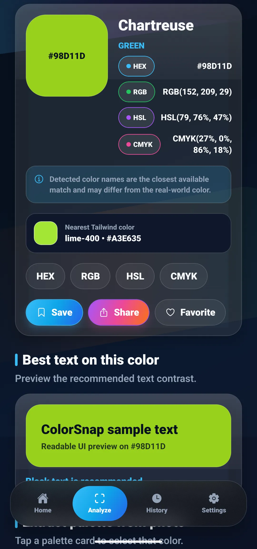
- Read the HSL value, not just the name. In ColorSnap, the result card shows the nearest name, HEX, RGB, HSL, and CMYK. The screenshot at the top of this guide shows a reading of
#98D11Dnamed Chartreuse, with HSL(79, 76%, 47%). That is a yellow-leaning hue with high saturation, so it is a vivid yellow-green, not a sage or moss. - Check the saturation before trusting the hue. If saturation is below about 10%, the item is effectively gray, whatever the hue says.
- Take a second reading. Sample another spot on the same item. If the hue stays in the same band, you can trust the result. If it jumps by 20° or more, the light or the material is changing the reading.
- Save the code, not the name. Save to History keeps the exact HEX value. A HEX code is something you can compare, paste, or send. A name like “sage” is not.
For a live view, the Live Camera Color Picker in ColorSnap shows the name, HEX, RGB, HSL, and CMYK as you move the sample area, with a consistency label that warns when the sample covers more than one color. The camera color identifier guide covers white balance and distance in more detail. If the same green gives you different codes each time, why your color picker gives different HEX codes explains sample size and texture.
If you have trouble telling greens from browns or reds by eye, the method in this guide is the same one recommended in the guide to identifying colors when you’re color blind: read the label and the numbers, not the swatch.
Using trend greens in a digital palette
Whatever green you sample, check it with text before it goes into an interface. Greens vary widely in how much contrast they give, because the green channel carries so much weight in luminance.
Using the WCAG contrast formula, here is how white text and near-black text (#1A1A1A) perform on each green. The minimum for ordinary text is 4.5:1.
| Background | White text | Near-black text |
|---|---|---|
Sage #9CAF88 |
2.36:1 | 7.38:1 |
Moss #8A9A5B |
3.06:1 | 5.68:1 |
Olive #808000 |
4.20:1 | 4.15:1 |
Forest green #228B22 |
4.39:1 | 3.97:1 |
Teal #008080 |
4.77:1 | 3.65:1 |
Dark olive green #556B2F |
5.95:1 | 2.93:1 |
Hunter green #355E3B |
7.46:1 | 2.33:1 |
Three patterns stand out:
- Light, muted greens need dark text. Sage and moss fail with white text.
- Mid-tone greens can fail with both. Olive and forest green fall short of 4.5:1 with either white or near-black. Darken or lighten them a step before using them behind body text.
- Deep greens need light text. Dark olive green and hunter green work well with white.
The ratios are rounded. Test your exact pair, especially near the threshold. For more on choosing text colors, read the color contrast checker guide, and to build a full set of shades from a single green, follow how to build a color palette from one color.
Name it by its numbers
Green names are useful for conversation and unreliable for decisions. When you need to know whether something is sage, olive, or moss, read the hue for the lean, the saturation for how muted it is, and the lightness for how deep it is. Sample in even light, take a second reading, and keep the HEX code.
To see how ColorSnap reads colors from photos and the camera, visit the Android color identifier page, or browse more color code guides.
Questions
Frequently asked questions
What is the difference between sage and olive green?
Sage is a light, muted green with low saturation, so it looks soft and slightly gray. Olive is a dark yellow-green with much higher saturation. A common sage value, #9CAF88, is HSL(89, 20%, 61%), while CSS olive, #808000, is HSL(60, 100%, 25%). Lightness and saturation separate them more clearly than hue does.
What is the HEX code for sage green?
There is no single official sage. #9CAF88 is one of the most widely listed values, but others such as #B2AC88 also circulate, and that one is closer to a yellowish greige. Sage is not one of the CSS named colors, so always record the exact HEX code rather than relying on the name.
Is olive a shade of green or yellow?
Both, depending on the shade. CSS olive, #808000, has a hue of 60 degrees, which is the hue of yellow at low lightness. Dark olive green, #556B2F, has a hue of 82 degrees and sits in the green range. Many people call both olive, which is why the hue number is more useful than the name.
Why does a green look different in a photo than in person?
The camera records the color of the light as well as the object. Warm indoor light pushes greens toward yellow and olive, while shade and overcast daylight push them toward blue. Leaves and glossy fabric also reflect bright highlights. Sample a flat, evenly lit area and take a second reading before deciding.
What text color works on sage green?
Dark text. Using the WCAG contrast formula, #9CAF88 with near-black #1A1A1A gives about 7.38:1, while white text on the same sage gives about 2.36:1, which is below the 4.5:1 minimum for ordinary text. Test your exact pair, because sage values vary.
Explore ColorSnap color tools
Start from the ColorSnap homepage or review the complete app features. For focused workflows, learn about the color identifier for Android and iOS, use the photo color picker, or explore the image palette generator. The ColorSnap FAQ answers common questions about formats, images, saved colors, and app usage.